Design comparison
Community feedback
- @VCaramesPosted about 2 years ago
Hey there! 👋 Here are some suggestions to help improve your code:
-
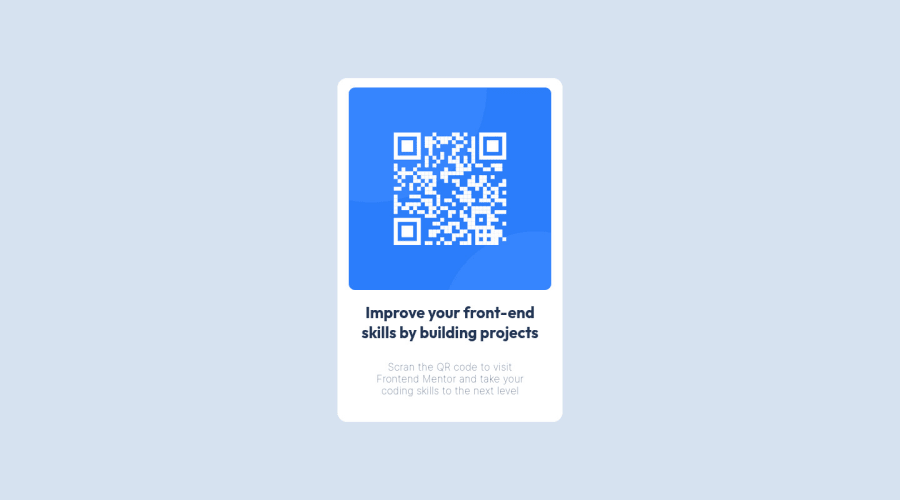
To better identify the main content of you site you will want to encase your entire component inside a Main Element.
-
The Alt Tag description for the QR image needs to be improved upon. Its needs to tell screen reader users what it is and where it will take them to when they scan it.
-
Reduce 📉 the
widthof you component to better match the FEM design. -
Change
widthtomax-widthin your component’s container to make it responsive. -
Change
widthto `max-width: 100% in your image to make it responsive.
If you have any questions or need further clarification, let me know.
Happy Coding! 👻🎃
0 -
- @Roboko11Posted about 2 years ago
seem pretty good you won a lot of time with display flex and i think you forgot the mobile design it's really easy you can do it if you want
0
Please log in to post a comment
Log in with GitHubJoin our Discord community
Join thousands of Frontend Mentor community members taking the challenges, sharing resources, helping each other, and chatting about all things front-end!
Join our Discord
