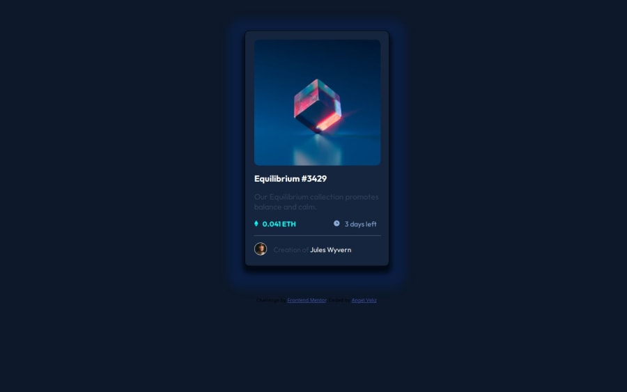


Design comparison
SolutionDesign

Community feedback
- P@nishanth1596Posted 3 days ago
Hi Angel Veliz,
Great work! Since your code isn't in English, I may not be able to deep dive fully, but I'll do my best to provide helpful feedback.
- Margin and Centering Issue: Instead of using a fixed margin: 70px auto, you could use the following approach for better responsiveness:
body {
    display: flex;
    justify-content: center;
    align-items: center;
    height: 100vh;
    margin: 0;
    background-color: #f0f0f0;
}

.envoltura {
    max-width: 300px;
}
This ensures the content stays centered on all screen sizes. On my screen (which is wider than 1440px), the content appears shifted to the left.
- Avoid setting a fixed width for content, images, etc., as it may look good on your screen but not on all screen sizes. Instead, design responsively so that the browser adjusts the layout properly across different devices.
You can test this while developing by using the developer tools in your browser and adjusting the screen size to see how your site responds.
By the way, great work! Keep working hard—you're doing well! 😊
0

Please log in to post a comment
Log in with GitHub
Join our Discord community
Join thousands of Frontend Mentor community members taking the challenges, sharing resources, helping each other, and chatting about all things front-end!
Join our Discord