Design comparison
Community feedback
- @zarakPosted 27 days ago
Hi!
The card could use a bit of a
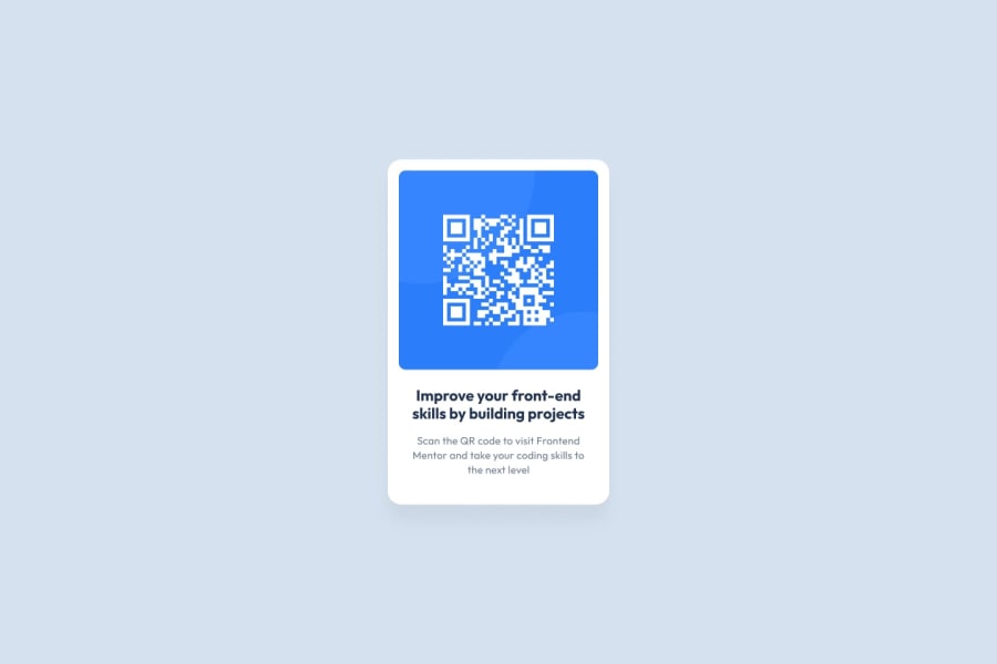
box-shadowto look more like the design spec. The border radius could be a little higher for the card as well, as the design seems to have rounder edges. Theborder-radiusof the image itself looks good though! Theh1font size is a bit small compared to the design. You could also experiment with giving it afont-shadow.Apart from that, the colours look good! And the font styles are correct. You may wish to experiment with the line-height but that might be a minor detail. You could try using CSS variables for the colours, although for a project this small it's probably not needed.
Great work!
0
Please log in to post a comment
Log in with GitHubJoin our Discord community
Join thousands of Frontend Mentor community members taking the challenges, sharing resources, helping each other, and chatting about all things front-end!
Join our Discord
