Design comparison
SolutionDesign
Solution retrospective
What are you most proud of, and what would you do differently next time?
Me gusto haber practicado css puro sin framewors
What challenges did you encounter, and how did you overcome them?aprender a usar figman
What specific areas of your project would you like help with?al momento de nombrar las clases y los commit
Community feedback
- P@DocForLoopPosted 5 months ago
Hi, here are my suggestions :
- due to GDPR compliance check @font-face rules ,as these font files are in your project.
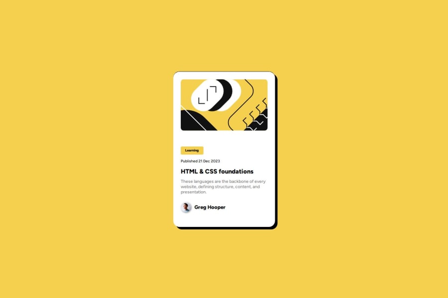
- missing hover effects on the card
- consider using relative CCS units like rem, em, % .. instead px
- check your margins and paddings in figma files, because there are unnecessary gaps in the layout
- check clamp() function for font-sizes
Hope it will help you.
Marked as helpful0 - @milkoqqPosted 5 months ago
I guess the layout gaps feel a little different, and there is the left border missing from the card.
Marked as helpful0@GinoGallardoPosted 5 months agoGracias por tu apreciación no había visto el borde izquierdo 🤦@milkoqq
0
Please log in to post a comment
Log in with GitHubJoin our Discord community
Join thousands of Frontend Mentor community members taking the challenges, sharing resources, helping each other, and chatting about all things front-end!
Join our Discord
