Design comparison
Solution retrospective
Me orgulho de ter conseguido fazer o desafio praticamente sozinho, sem procurar muita coisa na internet. Da próxima vez pretendo estudar toda a estrutura com calma para conseguir fazer o site
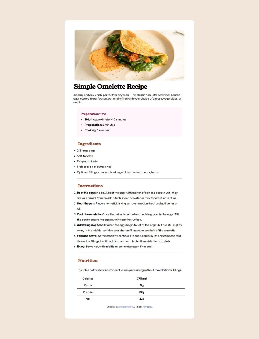
What challenges did you encounter, and how did you overcome them?Enfrentei desafios na parte de realizar a tabela nutricional, não consegui deixar ela totalmente responsiva
What specific areas of your project would you like help with?responsividade div
Please log in to post a comment
Log in with GitHubCommunity feedback
- @Adabe4
I have one comment about your solution. The design has a straight line on the left inside the box, where the content aligns. Yours is quite ragged. Especially the pink box looks a bit out of place to me.
In my solution, I created this box around a paragraph. Then the header was before the list started and the box width fit the paragraph width and not just the list width.
Other than that your solution looks really close the design, well done!
Join our Discord community
Join thousands of Frontend Mentor community members taking the challenges, sharing resources, helping each other, and chatting about all things front-end!
Join our Discord
