Design comparison
Solution retrospective
saber muy bien como manejar el estilo de display: grid en css y me gusto como lo diseñe sin dificultad
What challenges did you encounter, and how did you overcome them?creo que ninguno
What specific areas of your project would you like help with?en todo un poco estaria bien me ayudaria mucho
Community feedback
- @matt2282Posted 8 months ago
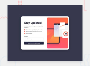
You did the email validation and switching of the pages correctly and the general layout of the page is good, but it does have a lot of issues.
The email input has a cursor pointer when it should be a text selection pointer(this is default I believe). Desktop: -background color should be hsl(235, 18%, 26%)
- The padding on the right of the image gets messed up when you switch from mobile back to desktop.
- Missing a space on "Stay updated!"
- I'd recommend setting a fixed height/width for the outside container because things get weird when the container gets resized.
- Also recommend keep the image at a fixed size. -Could use a bit more padding especially on the left.
Mobile:
- The original design has the image at the very top of the page while your solution has it centered and the desktop background visible.
Success Page:
- Misspelled "subscribing!"
- The email should be the same as the email you entered in the box on the first page not ash@loremcompany.com every time.
- You forgot to make a mobile friendly version. It looks not right on mobile.
0
Please log in to post a comment
Log in with GitHubJoin our Discord community
Join thousands of Frontend Mentor community members taking the challenges, sharing resources, helping each other, and chatting about all things front-end!
Join our Discord
