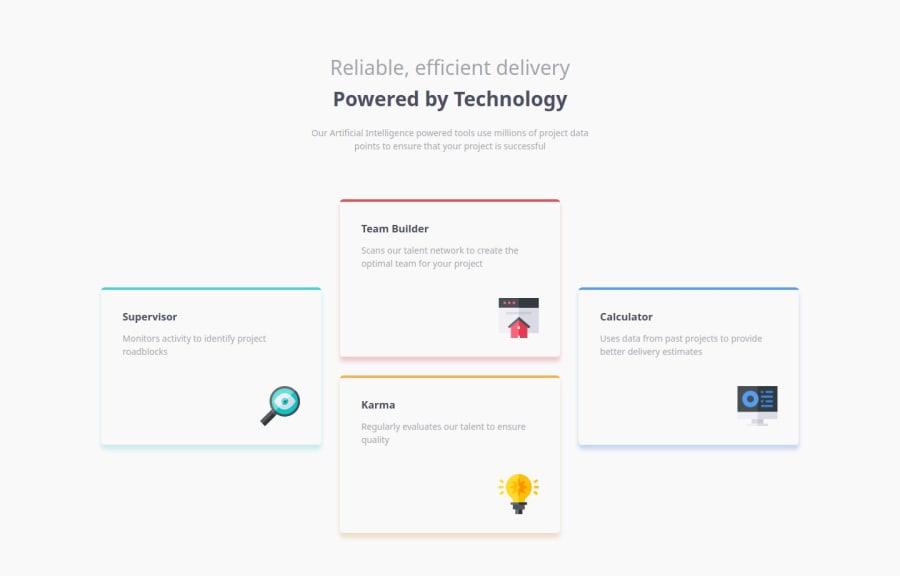
Page with 4 adaptive function cards (HTML, CSS, JS)
Design comparison
Solution retrospective
I finally started getting cozy with CSS Grid. I used to be all about Flexbox like it was my safety blanket, but now Grid and I? Weāre pretty tight. Less āwait, what?ā moments and more āI got this.ā
What challenges did you encounter, and how did you overcome them?So, Iāve been messing around with JavaScript lately, and honestly, it's like giving my site a shot of espressoāitās all animated and interactive now! No more boring static pages, everythingās moving and grooving, making the whole thing look way more legit.
Oh, and I learned how to throw in modal windows like a pro. Seriously, itās a game-changerāespecially for mobile users. Pop-ups have never been so satisfying.
What specific areas of your project would you like help with?Iād love some advice on optimizing my code. I'm looking to make it cleaner and faster. If you have any tips for writing concise, efficient code that performs better, Iām all ears! And hey, any other advice is more than welcome, because thereās no such thing as too much improvement!
Community feedback
- @StroudyPosted 2 months ago
Awesome job tackling this challenge! Youāre doing amazing, and I wanted to share a couple of suggestions that might help refine your approachā¦
-
Having a clear and descriptive
alt
text for images is important because it helps people who use screen readers understand the content, making your site more accessible. It also improves SEO, as search engines usealt
text to understand the image's context, helping your site rank better, Check this out Write helpful Alt Text to describe images, -
For future project, You could downloading and host your own fonts using
@font-face
improves website performance by reducing external requests, provides more control over font usage, ensures consistency across browsers, enhances offline availability, and avoids potential issues if third-party font services become unavailable. Place to get .woff2 fonts -
Using
rem
orem
units in@media
queries is better thanpx
because they are relative units that adapt to user settings, like their preferred font size. This makes your design more responsive and accessible, ensuring it looks good on different devices and respects user preferences.
Youāre doing fantastic! I hope these tips help you as you continue your coding journey. Stay curious and keep experimentingāevery challenge is an opportunity to learn. Have fun, and keep coding with confidence! š
Marked as helpful1 -
- @MikDra1Posted 2 months ago
Nice one š
If you are curious how you can do this straight lines on the top of each card here is my tip:
Create another element in each of the cards. Then position this element absolute. Card should be positioned relative. At the end you need to give this element a height of 3px width of 100% and top 0 and left 0. You can also use ::after or ::before pseudo elements to create these.
Hope you found this comment helpful š
Good job and keep going ššš
Marked as helpful0
Please log in to post a comment
Log in with GitHubJoin our Discord community
Join thousands of Frontend Mentor community members taking the challenges, sharing resources, helping each other, and chatting about all things front-end!
Join our Discord