Design comparison
SolutionDesign
Community feedback
- P@tobaojoPosted 5 months ago
Great start so far.
The code is well structured and makes a sense.
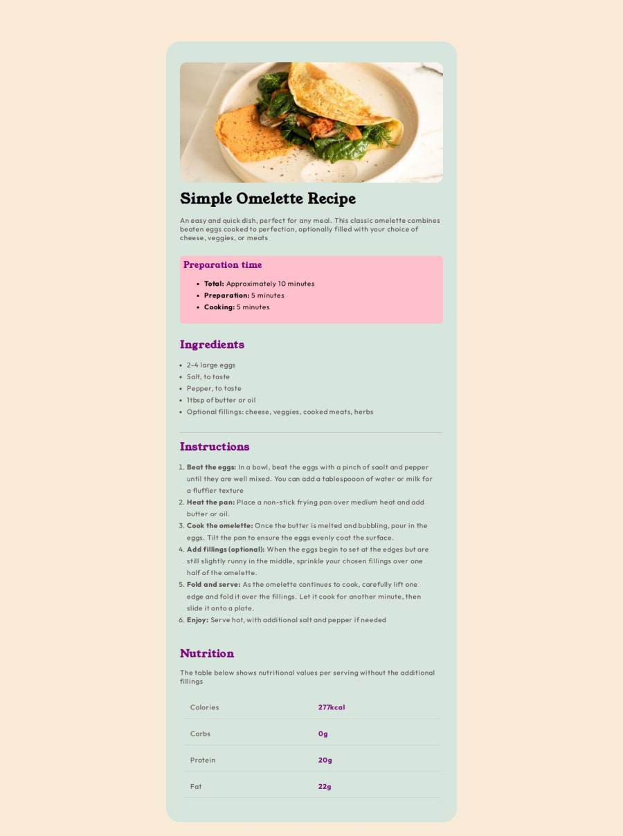
Though i'm not sure why you opted to use those colours as they differ from the original design a fair bit. I think you should take another look at the designs.
Additionally, your solution doesn't follow the mobile design. (Though it still works on mobile devices)
0
Please log in to post a comment
Log in with GitHubJoin our Discord community
Join thousands of Frontend Mentor community members taking the challenges, sharing resources, helping each other, and chatting about all things front-end!
Join our Discord
