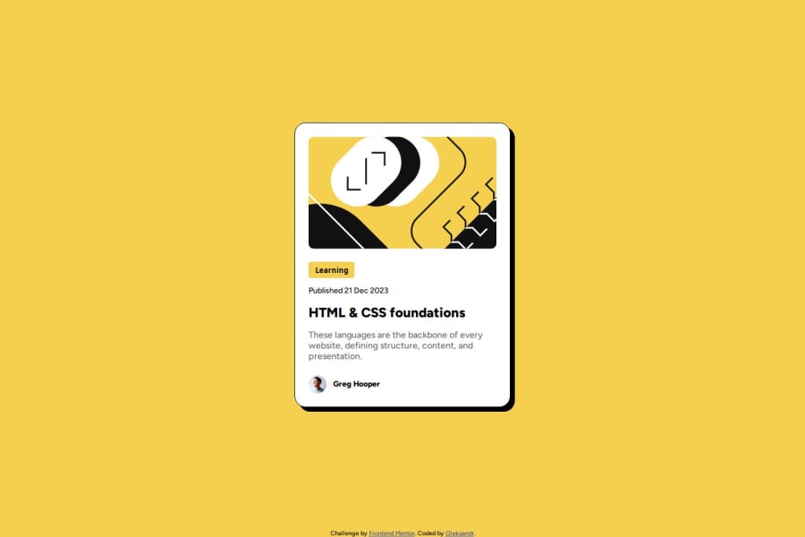
Design comparison
SolutionDesign
Solution retrospective
What are you most proud of, and what would you do differently next time?
I'm proud to have learned how to use some of the Figma tools while developing this project.
What challenges did you encounter, and how did you overcome them?I don't fully understand how fonts work.
What specific areas of your project would you like help with?I need to figure out how fonts work after connecting.
Community feedback
- @firdaus3Posted 6 months ago
Hi Sanya-Zg, great job on this project! You've done a really good job implementing the design
Areas to Improve
- Try using relative units like
remoreminstead ofpxto improve responsiveness and scalability - Add smooth transitions to hover effects for a more interactive feel.
Great work overall! 👏
0 - Try using relative units like
Please log in to post a comment
Log in with GitHubJoin our Discord community
Join thousands of Frontend Mentor community members taking the challenges, sharing resources, helping each other, and chatting about all things front-end!
Join our Discord
