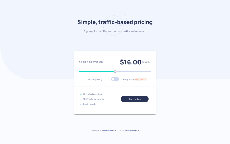
Submitted about 3 years ago
Page Interactive-pricing-component, responsive HTML, CSS GRID
@Mtc-21
Design comparison
SolutionDesign
Solution retrospective
comments or suggestions are welcome
Community feedback
- @pikapikamartPosted about 3 years ago
Hey, great work again on this another solution. The desktop view looks fine, it's just a bit pushed down, the
h1is bit bigger and thebox-shadowfor the form could be made more smoother. The site is responsive though and the mobile state looks fine as well.For some other suggestions, here are some:
- On this one, you could just use
divinstead ofheaderand put it inside themaintag since this is just a single main-content. Typically, a primaryheaderconsist of the site-logo, navlinks and maybe some controls. - Also, since this is just a one-column layout, you could just omit the
display: gridon thebodytag and just add like amin-heighton theformor just add sizing on the elements if needed. Because I noticed that when you resize the screen's height when in dev tools at the bottom, the layout shifts a lot and reduces it's height. - For the slider, the text...page-views is not really suited to a
labelon that one since it is quite ambiguous on what does it mean and if you look at it, changing the slider changes the pricing, it would be nice to make those 2 announced. For this one, you could create anaria-liveelement that will announce the changes for the 2 items or use anoutputtag on those 2 items, the page-views and the pricing. You could either one. - For the
input type='range', it would be nice to use eitheraria-labelattribute or asr-onlylabeltag. Then use a meaningful text to be used as the value, it could be likepricing selectionsomething like that or if you could make up more meaningful, that would be nice. - When wrapping up a text-content, make sure that it is inside a meaningful element like
ptag or heading tag and not using likediv, spanto wrap the text. - For the billing section, since the two are selection of billing choice, instead of using checkbox, you should use radio-buttons whenever there are selections where you can only select one. For that one, you should use a
fieldsettag to wrap the radio-buttons, asr-onlylegendtag to which contains a text that will describe the set of radio buttons, have 2labelit will be the month and yearly text. I don't recall if I use this markup before when I did this, but I have this simple snippet about theme-toggle if you like. Though it is different, the markup is the same on both. Let me know if you have queries about this one. - Also, this layout is basically a
formwhere thestart my trialtext is the submit-button, therefore it would be nice to useformtag inside themainto wrap the component and usebutton type="submit"instead ofatag.
Aside from those, great job again on this one.
Marked as helpful0 - On this one, you could just use
- @Mtc-21Posted about 3 years ago
Hi merry christmas, thanks for your comments and the suggestion 👍, i have applied some of your suggestions, I haven't applied the fieldset tag change yet, but I understand you say the relation with sr-only.
1
Please log in to post a comment
Log in with GitHubJoin our Discord community
Join thousands of Frontend Mentor community members taking the challenges, sharing resources, helping each other, and chatting about all things front-end!
Join our Discord
