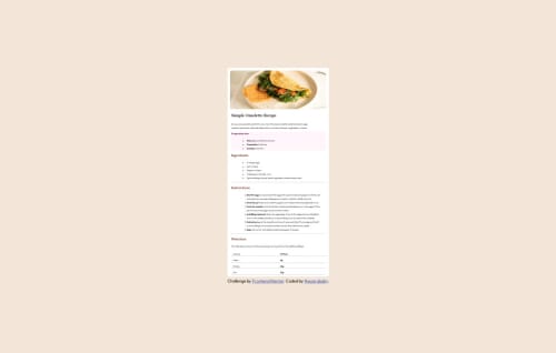
Design comparison
SolutionDesign
Solution retrospective
What are you most proud of, and what would you do differently next time?
i am proud of my improvement in using flexbox
What challenges did you encounter, and how did you overcome them?image placement was one the challanes i encountered
What specific areas of your project would you like help with?i need help in using the figma designs. i have no idea how it works
Community feedback
- @0xabdulkhaliqPosted 7 months ago
Hello there 👋. Congratulations on successfully completing the challenge! 🎉
- I have a suggestion regarding your code that I believe will be of great interest to you.
HTML 🏷️:
- This solution may cause accessibility errors due to lack of semantic markup, which causes lacking of landmark for a webpage and allows accessibility issues to screen readers.
- What is meant by landmark ?, They used to define major sections of your page instead of relying on generic elements like
<div>
or<span>
. They are use to provide a more precise detail of the structure of our webpage to the browser or screen readers
- For example:
- The
<main>
element should include all content directly related to the page's main idea, so there should only be one per page - The
<footer>
typically contains information about the author of the section, copyright data or links to related documents.
- The
- So resolve the issue by replacing the
<div class="container1">
element with the proper semantic element<main>
along with<div class="attribution">
into a<footer>
element in yourindex.html
file to improve accessibility and organization of your page
- Additionally you need to purge unwanted wrapping of two
div
elements using.wrapper
div element.
- This is the current markup,
<body> <div class="wrapper"> <div class="container1"></div> <div class="attribution"></div> </div> </body>
- You need to update your markup into,
<body> <main class="container1"></main> <footer class="attribution"></footer> </body>
- Don't worry about the
attribution
because you easily place it bottom usingposition
absolute property.
- Just add the following styles,
body { position: relative; } .attribution { position: absolute; bottom: 1em; }
.
I hope you find this helpful 😄 Above all, the solution you submitted is great !
Happy coding!
Marked as helpful0
Please log in to post a comment
Log in with GitHubJoin our Discord community
Join thousands of Frontend Mentor community members taking the challenges, sharing resources, helping each other, and chatting about all things front-end!
Join our Discord