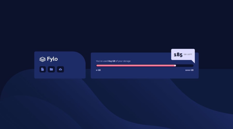
Overlapping elements using position absolute.
Design comparison
Solution retrospective
This challenge seemed much simpler at first. I struggled to decide whether some elements should have a specific height and width or if it was better to use percentages, as in the case of the gradient bar. Also, adjusting the size of the two main boxes was tricky. Finally, I used Grid for this, so the sizes remained fixed through grid-template-columns.
What specific areas of your project would you like help with?I would like to know a better technique for adding shapes like the triangle in the white box. Although I was able to create and resize it, I’m not sure if using position: absolute was the best way to place it. I was concerned that it might move out of place when the page size changes.
Community feedback
Please log in to post a comment
Log in with GitHubJoin our Discord community
Join thousands of Frontend Mentor community members taking the challenges, sharing resources, helping each other, and chatting about all things front-end!
Join our Discord
