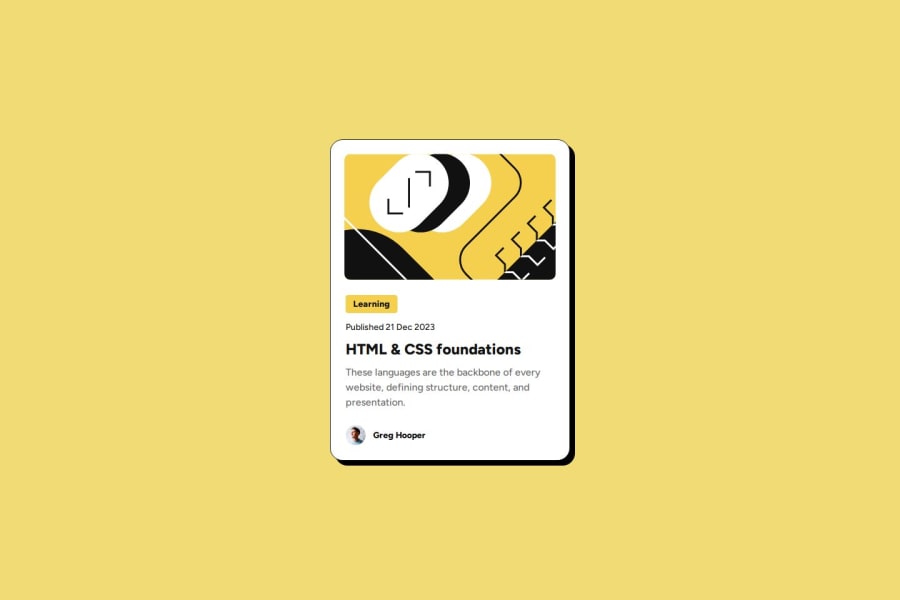
Design comparison
SolutionDesign
Solution retrospective
What are you most proud of, and what would you do differently next time?
I figured out how to interpolate between two layouts nicely without container/media queries. I think I like how it looks.
What specific areas of your project would you like help with?Is there an easier way to "lerp" something without using clamp? I feel like what I made can be fragile when stuff will be added to the card.
Community feedback
Please log in to post a comment
Log in with GitHubJoin our Discord community
Join thousands of Frontend Mentor community members taking the challenges, sharing resources, helping each other, and chatting about all things front-end!
Join our Discord
