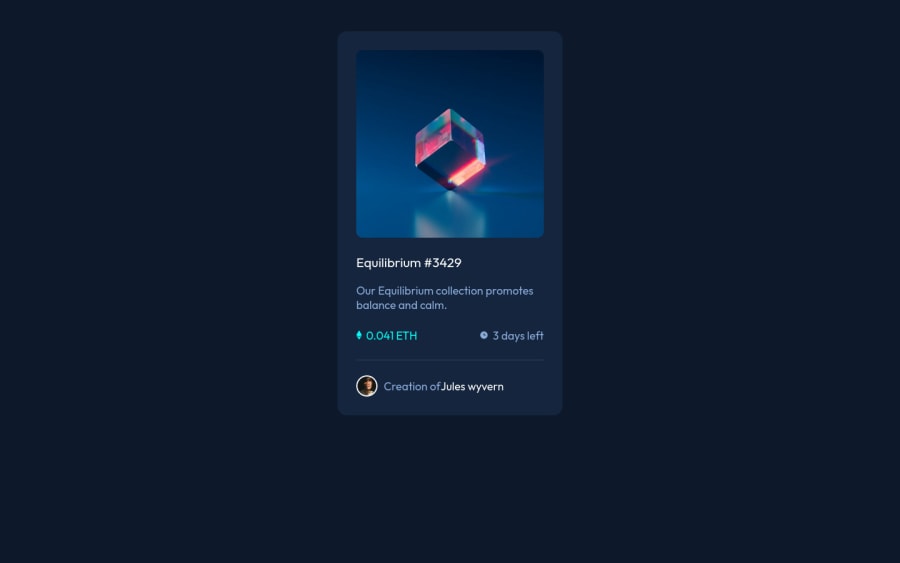
Design comparison
Solution retrospective
Couldn't figure out how to change the icon color to white, tried using color, still didnt work.
Also couldn't figure out how to add space in span.....error = >ofjules wyvern>
Community feedback
- @hyrongennikePosted about 2 years ago
Hi @Galahad-py,
Congrats on completing the challenge
You can replace your body rule with the one below to the center card on the page.
body { background-color: hsl(217, 54%, 11%); margin: 0; font-family: 'Outfit', sans-serif; color: hsl(215, 51%, 70%); display: flex; flex-direction: column; justify-content: center; align-items: center; text-align: center; min-height: 100vh; }
Because the overlay color is on the background on the div that surrounds the eye icon, the icon is underneath the overlay and you're also apply opacity to both the overlay and icon. You can use pseudo elements. before and after to create the overlay and add the eye icon. See my solution below.
Hope this is helpful
Marked as helpful0 - @milosshomyPosted about 2 years ago
Hey , good job on finishing this challenge. You can use fillter: brigthness(100) to change image color to white and for the space try to not wrap image and text in h4 , wrap it with div and then use image with two spans. Keep coding! :D
Marked as helpful0
Please log in to post a comment
Log in with GitHubJoin our Discord community
Join thousands of Frontend Mentor community members taking the challenges, sharing resources, helping each other, and chatting about all things front-end!
Join our Discord