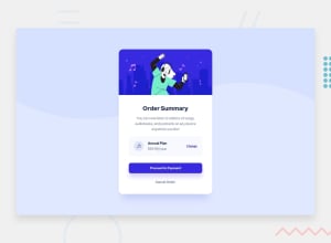
order-summery page with Flexbox
Design comparison
Solution retrospective
Need review on my code and what can I improve in the code. to make it better?
Community feedback
- P@brodiewebdtPosted about 3 years ago
The design looks great. I should have mentioned that you should change the Annual Plan H4 to an H2. You don't want to skip heading levels. I wouldn't change it now., just something to keep in mind.
Download AXE DevTools and it will help you clear accessibility warnings will you code. Any color contrast issues can be ignored since they are part of the design. https://www.deque.com/axe/devtools/
Glad I could help.
0 - P@brodiewebdtPosted about 3 years ago
You need to work on your alignment issues. At the smaller size the the Annual Plan box shifts over to the right side of the card. At the larger size the elements don't align properly.
Change the H2 for the Order Summary text to an H1 and it will clear the accessibility warnings.
I hope this helps.
0@MordenWebDevPosted about 3 years ago@brodiewebdt hey thankyou for your feed back. I have made some changes and if you have time pls leave a review.
0
Please log in to post a comment
Log in with GitHubJoin our Discord community
Join thousands of Frontend Mentor community members taking the challenges, sharing resources, helping each other, and chatting about all things front-end!
Join our Discord
