

Design comparison

Solution retrospective
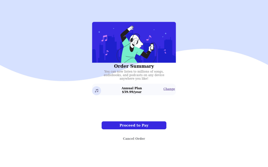
i will be grateful if someone could kindly help me with the background and the mobile view. thank you
Community feedback
- @AngelusLovellPosted over 3 years ago
@Ibyazz3, bro. I m not an expert, still trying to help I tried to read your code but didn't.
Since I didn't check your code, I will simply put out the way I would go about it.
First, Make a container element or a wrapper that will contain the card inside it with Flex and justify it to the center. Making sure the width of the container element is 100% of the screen width.
Second, The card element will contain all the visible components inside it with their relevant width. And Have the Card element with its width in percentage somewhere between 30% to 60% in mobile devices 90% maybe then give it a relevant max-width in units like "rem" (30rem to 60rem).
This will stop your card and its background from flowing outside of the screen in mobile devices and shrink when needed.
Hope that helps.😁
Marked as helpful1@Ibyazz3Posted over 3 years ago@ShashaGazem thank you very much sir.. i will surely do that.
0

Please log in to post a comment
Log in with GitHub
Join our Discord community
Join thousands of Frontend Mentor community members taking the challenges, sharing resources, helping each other, and chatting about all things front-end!
Join our Discord