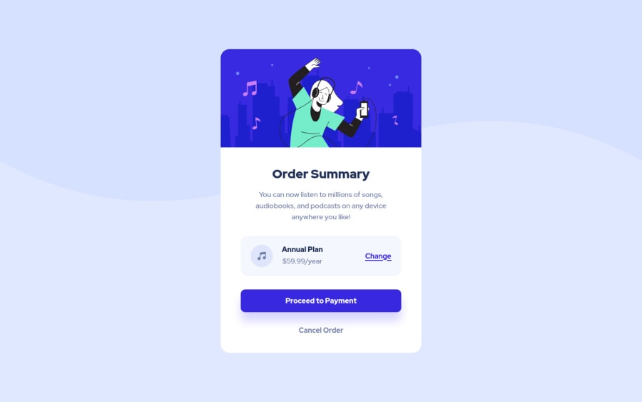
Design comparison
SolutionDesign
Community feedback
- @atif-devPosted almost 2 years ago
Hi Jihane, congrats🎉 on completing the challenge. Better take care about following points.
- Always check Frontendmentor Report Generator issues after submitting the project for removing errors and warnings. To avoid accessibility issue "Document should have one main landmark" use code as :
<body>
    <main>
        ---your code here----
    </main>
  <footer>
  </footer>
</body>
(why
mainmatters? Read here)- Since we tackle responsive design in challenges so it is preferred to use
emunit for padding and margin andremunit for font-size. For further info watch this video - When we open GitHub repository link, at right side you will find an About Section. There, also include live preview link of your project. It is better for someone to check your live project while interacting with code.
- Include a README file in your GitHub project's solution and write about your working flow, findings, new learned things, useful resources, etc.
If the Feedback is Helpful for you, Don't Forget to upvote and click on MARKED AS HELPFUL 😇......That Will Make me feel Happy to Help someone😇
Marked as helpful1
Please log in to post a comment
Log in with GitHubJoin our Discord community
Join thousands of Frontend Mentor community members taking the challenges, sharing resources, helping each other, and chatting about all things front-end!
Join our Discord
