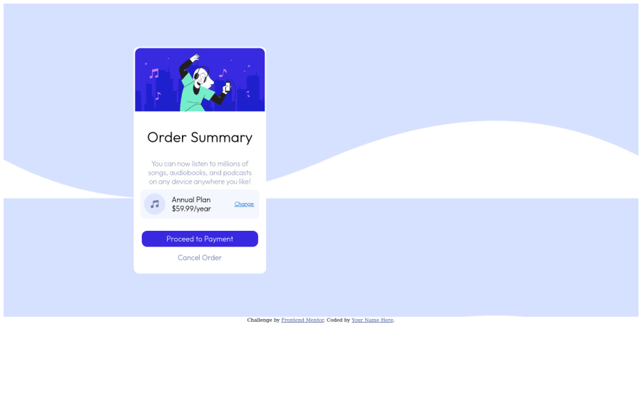
Design comparison
SolutionDesign
Solution retrospective
I would appreciate any tips and advice to help improve my code
Community feedback
- @DrougnovPosted over 2 years ago
Hello @pharaohmak, good job on the design. Still, you can make a lot of improvements to your codes. Here are some suggestions for you:
- Your HTML isn't semantic. To fix that you can use some tags like
header
main
section
footer
instead of div. - The card should be in the center of the page. Add
justify-items: center
on the container to move it to the center. - The background image is not aligned well. To fix it use
hsl(225, 100%, 94%); background-size: contain; background-position-y: -15%; ```
on the body.
- You have only downloaded font-weight 200. That's why the heading isn't bold. Re-download the font or use this @import url("https://fonts.googleapis.com/css2?family=Red+Hat+Display:wght@500;700;900&display=swap"); in your CSS.
Have a good day my friend :)
Marked as helpful0@pharaohmakPosted over 2 years ago@Drougnov thank you for the feedback, very helpful!
0 - Your HTML isn't semantic. To fix that you can use some tags like
Please log in to post a comment
Log in with GitHubJoin our Discord community
Join thousands of Frontend Mentor community members taking the challenges, sharing resources, helping each other, and chatting about all things front-end!
Join our Discord