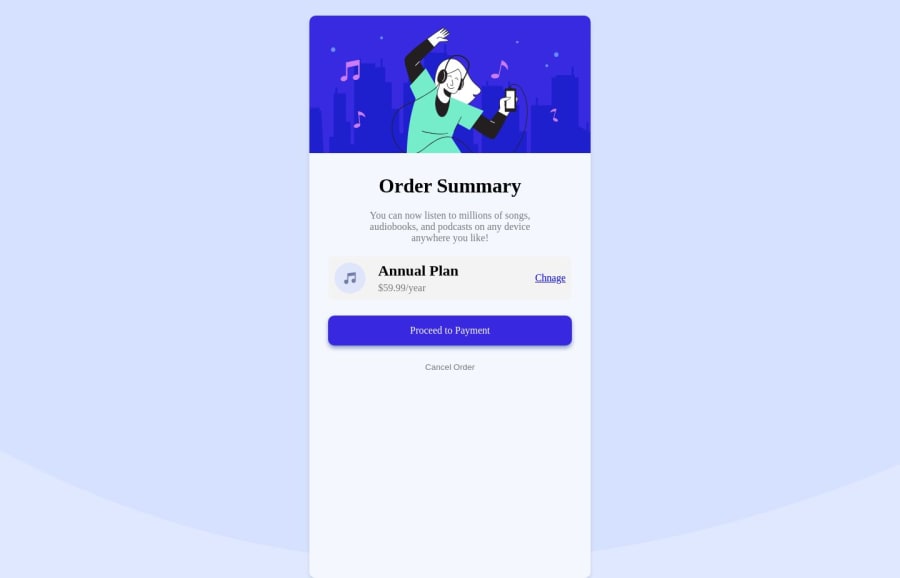


Design comparison

Solution retrospective
corrections are suggestions are well welcome... thank you for your time
Community feedback
- @DigitaleWeltLibraryPosted about 1 year ago
Hey, there is a small error in your CSS:
Instead of
height:100%;writeheight: fit-content;or delete the line.Happy coding
0 - @ofthewildfirePosted about 1 year ago
Hi! Good solution, I just have a few things I think could be helpful
-
While you do import your google font, you actually haven't used it anywhere, you'll need to use it as a
font-family: "font-name";with the elements you need to apply that font to. Eg.font-family: 'Red Hat Display';would be one of them, when you copy-paste the link, it also provides the names of the fonts on the Google interface in the sidebar! :) -
Within your
.containerclass, there is no real need for the margin-top/margin-bottom, in my experience using margins is kinda a way to confuse a situation. To center the card, you can use flexbox on the body, eliminating the need for the margin hack. <3
body { display: flex; justify-content: center; align-items: center; min-height: 100vh; }-
Within your
.containerclass, you're using fixed width and this makes it not a good viewing experience on mobile/smaller screen, currently your container is set to 450px, so, if I shift to mobile it has over-scroll, in general fixed-width items is no bueno :) - a fix for this would be to use a max width for now and maybe do further research on width in CSS for responsiveness. This will help it flow better though>max-width: 400pxand also, removing theheighton your.containerwould go a long way. Height is not needed. :) -
Removing the
widthon your container, will mean that your image will be out of the container, images should be able to resize with their content, so, to fix this, adding a width to the image would be very beneficialmax-width: 100%; -
Finally, not really needed, but, I think it looks better, adding a
flex-wrap: wrapon your.twoclass div so that when the screen is smaller it wraps to the next line and looks neater might be helpful.
PS: If you want to not make it flush against the edges, and add some space. Which I guess some people like, adding a
margin: 0 1em;to the container would do that! :)Overall, a great solution and I hope this was helpful~
Happy coding! :)
0 -


Please log in to post a comment
Log in with GitHub
Join our Discord community
Join thousands of Frontend Mentor community members taking the challenges, sharing resources, helping each other, and chatting about all things front-end!
Join our Discord