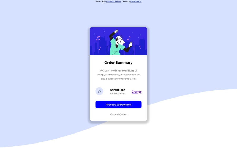
Design comparison
SolutionDesign
Community feedback
- @RioCantrePosted almost 3 years ago
Hello there! Good job in this challenge. Viewing the solution, I think you should consider the following as well…
- Remove all the properties in the
.containerrule set and add it on thebodyrule set. Includebackground-size: cover;,background-position: top;andbackground-repeat: no-repeat;. Removebackground-position: -800px;,height: 100vh;andwidth: 100%; - Add
background-color: hsla(223, 41%, 95%, 1),padding: 1rem;andborder-radius: 10px;in the.planrule set - For HTML structures, use semantic tags accordingly. Refer it with this one Semantics
- Include description with the
altin image tags. Like this line<img src="./images/icon-music.svg" alt="">
Above all, Well done! Keep it going!
0 - Remove all the properties in the
- @AlazarG19Posted almost 3 years ago
i suggest you move your background a little higher u can do it by adjusting the background-position-y property
0
Please log in to post a comment
Log in with GitHubJoin our Discord community
Join thousands of Frontend Mentor community members taking the challenges, sharing resources, helping each other, and chatting about all things front-end!
Join our Discord
