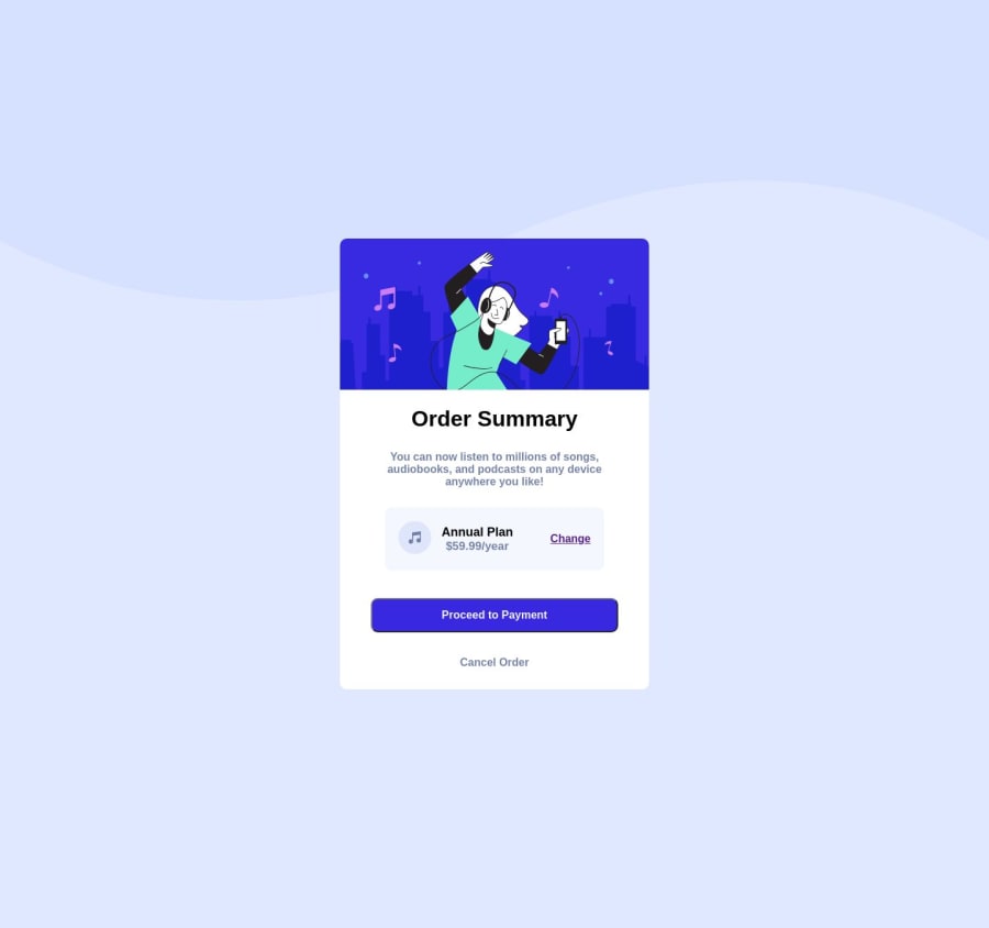
Design comparison
Solution retrospective
It was a very exciting and challenging task, when I got stuck, I had to go back and review my code for any missing div tag and other lapses. I also found it difficult to deploy this sight it turns out I forgot to add my images file. 😂
Community feedback
- @leonardoanselmoPosted over 1 year ago
- I looked at your HTML and CSS, I noticed that the <div> tag was missing, the others could be <div> without problem, it would look better maintenance. Take a look at this link.
-
Put the CSS in a folder
-
Do not use the px for sources is advisable to use the REM, as good practice, in the link I sent you, have other articles that explains better.
-
Make your HTML first on paper, drawing it, so you already anticipate the code.
-
I would not use the position to fix the layout. It is simple and you can use GRID or FLEXBOX and it would flow better.
-
The CTA button when you pass the mouse loses the mouse pointer, test it before, so you would avoid another commit to GIT.
-
Leave the height as min-height: 100vh, so you can visualize on a single screen.
-
The responsive is broken to width: 375px
Other than that it's great!
0
Please log in to post a comment
Log in with GitHubJoin our Discord community
Join thousands of Frontend Mentor community members taking the challenges, sharing resources, helping each other, and chatting about all things front-end!
Join our Discord
