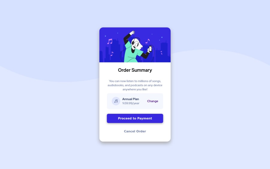
Design comparison
Solution retrospective
Any feedback or tips about the design or the code will be appreciated.
Community feedback
- @ChamuMutezvaPosted over 3 years ago
- use classes instead of id's. Classes are reusable
- use the div with the class of card as the
mainelement to fix some of the issues raised in the report. - let alt values be descriptive to benefit assistive tech users to visualize the message that is being put across.
<img src="./images/icon-music.svg" alt="icon">, screen readers automatically announce the presence of an image, writing it in the alt will be just like repetition. Decorative images usealt="" - well done with the presentation, it looks good
0@mauCZPosted over 3 years ago@ChamuMutezva Thanks for the tips and your time, i updated the deployment following the tips.
0 - @thesohailjafriPosted over 3 years ago
GREAT WORK,
here is some feedback for you
- make font-weight of 'order summary' bold
- add padding-bottom to the text below ' order summary'
else everything is great🙌.
have a good day maucz :]
0@mauCZPosted over 3 years ago@thesohailjafri Thanks dude, i updated the deployment following all tips :p
0 - @hafizanadliPosted over 3 years ago
the annual plan card seems too tight in some mobile screen. You can make the text or padding size smaller when in small screen.
Great job!
0@hackwithharshaPosted over 3 years ago@hafizanadli How to check in different mobile screens. is it using dev tools or there is any alternative ?
0@hafizanadliPosted over 3 years ago@hackwithharsha in chrome, there is toogle device toolbar
0@mauCZPosted over 3 years ago@hafizanadli Thanks for the feedback, yeah i already updated the project deployment following the tips on the comments.
1
Please log in to post a comment
Log in with GitHubJoin our Discord community
Join thousands of Frontend Mentor community members taking the challenges, sharing resources, helping each other, and chatting about all things front-end!
Join our Discord
