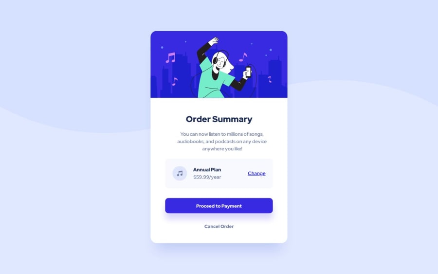
Not Found
Not Found
Not Found
Not Found
Not Found
Not Found
Not Found
Not Found
Not Found
Not Found
Not Found
Not Found
Not Found
Not Found
Not Found
Not Found
Not Found
Not Found
Not Found
Not Found

Submitted

Order-Summary-Component (Using HTML & CSS)

Maia 60

@maia-fw

Desktop design screenshot for the Order summary component coding challenge

This is a solution for...

  • HTML
  • CSS
1newbie
View challenge

Design comparison


SolutionDesign

Solution retrospective


I was having trouble with the responsiveness part of this project. What are the best ways to make this project responsive? Going from mobile to desktop and vice versa.

Community feedback

@jonahunuafe

Posted

When working with div, set the width using max-width in percentage, neglecting the height property since its height will be determine by the content inside the div.

Learn and practice how to use CSS Flexbox and CSS Grid for your layouts.

Always design and develop for mobile first before moving on to desktop design, for desktop design you can use a media query of max-width: 768px.

I hope this suggestions of mine help!.

Marked as helpful

1

@ExpertoMontanero

Posted

Creating a responsive design frontend involves implementing various techniques and best practices to ensure your website or application adapts to different screen sizes and devices. Here are some key steps and considerations to help you build a responsive frontend:

Mobile-First Approach: Start designing and developing your frontend with mobile devices in mind first. This approach ensures that the core functionality and content of your website work well on smaller screens.

Fluid Grids: Use CSS frameworks like Bootstrap or CSS Grid to create fluid grids that adjust the layout based on screen size. Grid systems allow you to define columns and rows that automatically adjust their width and height proportionally.

Responsive Images: Optimize your images for different devices and resolutions by using responsive image techniques. You can use CSS media queries and the srcset attribute to serve different image sizes based on the screen size and resolution.

CSS Media Queries: Utilize CSS media queries to apply different styles based on the screen width or device characteristics. Media queries allow you to define specific CSS rules for different breakpoints, making it easier to create a responsive layout.

Flexible Typography: Use relative units like percentages, ems, or rems to ensure that your typography scales appropriately across different devices. This allows the text to adapt to various screen sizes, improving readability.

Flexible Layouts: Avoid using fixed-width elements and use relative units for widths, margins, and paddings. Embrace the concept of fluid layouts, allowing your components and containers to resize and rearrange based on available space.

CSS Flexbox and Grid: Learn and leverage CSS Flexbox and Grid systems to create flexible and dynamic layouts. These powerful CSS features enable you to build complex and responsive designs with ease.

Touch-Friendly Interactions: Ensure that your user interface elements and interactive components are designed to be touch-friendly on mobile devices. Use larger touch targets, avoid relying solely on hover interactions, and provide appropriate feedback for touch events.

Hope I helped :>

Marked as helpful

1

Please log in to post a comment

Log in with GitHub
Discord logo

Join our Discord community

Join thousands of Frontend Mentor community members taking the challenges, sharing resources, helping each other, and chatting about all things front-end!

Join our Discord