Design comparison
SolutionDesign
Solution retrospective
Please help check my work, I would love your feedbacks on it.Thanks
Community feedback
- @roshankcpkrPosted over 2 years ago
Here are some of the things that I have noticed.
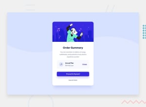
- Try increasing blur radius in box shadow property of class main-container and use rgba as color because you can use a as fourth property to set opacity.
- Font weight and color of title should be bolder and more blue.
- Fix hover color on proceed to payment button and also add 0.2em more padding top and bottom on it.
- Try decreasing opacity of background color on annual plan div. You can also use color in rgba format in this case.
0
Please log in to post a comment
Log in with GitHubJoin our Discord community
Join thousands of Frontend Mentor community members taking the challenges, sharing resources, helping each other, and chatting about all things front-end!
Join our Discord
