

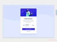
Design comparison
SolutionDesign


Solution retrospective
Cualquier Sugerencia, es aceptada! Saludos desde Chile.
Community feedback
- @AGutierrezRPosted almost 3 years ago
Wow! Esta genial! Tengo varias sugerencias que te podrían ayudar:
- En la sección
card-buttonsusastedisplay: flexpero no necesitasjustify-content: space-between, podrías quitar esa propiedad completa y aplicar unmargin-left: autoal elemento<a>. Esto hará que solo ese elemento se alinea a la derecha como esta en el diseño. - En algunas ocasiones hay que se cuidadoso con el uso de
widthcon valores fijos (px,rem,em), es mejor usar valores fijos con elmax-widthomin-width. - Relacionado con el punto dos, en la clase
.cardpodrías usar unwidth: 100%y un max-width:375px(linea31del archivo.scss). De esta forma no tendrías problemas con pantallas menores a375px - Para evitar tener que adivinar el tamaño máximo de los elementos internos, podrías usar un
paddingen el padre, en este caso el.card-bodypodría darte beneficios si le colocaspadding. Asi puedes hacer que el button tenga unwidth: 100%y el padding lo detendría.
Marked as helpful0@santi19999Posted almost 3 years ago@AGutierrezR, Muy bueno tu aporte amigo , lo pondré en práctica para seguir mejorando. Saludos
0 - En la sección
Please log in to post a comment
Log in with GitHub
Join our Discord community
Join thousands of Frontend Mentor community members taking the challenges, sharing resources, helping each other, and chatting about all things front-end!
Join our Discord