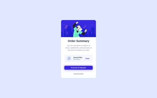
Order-summary-component

Solution retrospective
Hello, Frontend Mentor community. This is my solution for the product preview card component challenge
This is challenge 3 where I provide comprehensive guidance to fellow developers by adhering to industry best practices. By focusing on key areas such as - Semantic HTML
- Clean web page structure
- CSS enhancements
- Accessibility
- Performance Optimization
I aim to address common mistakes observed in the challenges submitted by other participants. Through this initiative, I hope to not only solve newbie-level projects but also share valuable insights and tips to aid in their learning journey. As a part of this initiative, I started a series Frontend Mentor - Learning from mistakes on Linkedin where I share common mistakes I found in newbies / junior challenges to assist all fellow newcomers in avoiding these pitfalls
- mistake 1: lang att
- mistake 2: inline css
Please log in to post a comment
Log in with GitHubCommunity feedback
No feedback yet. Be the first to give feedback on Mennatallah Hesham's solution.
Join our Discord community
Join thousands of Frontend Mentor community members taking the challenges, sharing resources, helping each other, and chatting about all things front-end!
Join our Discord