Submitted over 3 years agoA solution to the Order summary component challenge
Order-summary-component
@sarvothamgowda

Solution retrospective
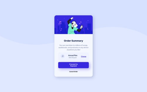
- Is it necessary to set the background size for the image in the body?
- Contents in the plan details were not aligned as per the design. Would like to know the solution for the same.
- Width of the pan details and payment button is not equal. How do I match the width of both elements?
Thanks for taking the time to review my work.
Code
Loading...
Please log in to post a comment
Log in with GitHubCommunity feedback
No feedback yet. Be the first to give feedback on Sarvotham Gowda's solution.
Join our Discord community
Join thousands of Frontend Mentor community members taking the challenges, sharing resources, helping each other, and chatting about all things front-end!
Join our Discord