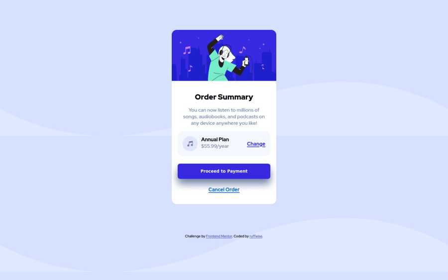
Design comparison
SolutionDesign
Solution retrospective
Feedback/suggestions are welcome
Community feedback
- @denieldenPosted almost 2 years ago
Hello Ruffwise, You have done a good work! 😁
Some little tips to improve your code:
- add
maintag and wrap the card for improve the Accessibility - also you can use
articletag instead of a simpledivto the container card for improve the Accessibility - remove all unnecessary code, the less you write the better as well as being clearer: for example the
divcontainer of image - To fix the top image in the background just put more specific background properties to the body:
background: url("../img/pattern-background-desktop.svg") no-repeat top center; background-size: contain; background-color: #e0e8ff;- remove all
marginfrom.div-containerclass - use flexbox to the body to center the card. Read here -> best flex guide
- after, add
min-height: 100vhto body because Flexbox aligns child items to the size of the parent container - add
transitionon the element with hover effect
Keep learning how to code with your amazing solutions to challenges.
Hope this help 😉 and Happy coding!
Marked as helpful0@ruffwisePosted almost 2 years ago@denielden Thank you so much for the tips, I have made adjustments to all the points you highlighted. Thanks a lot.
1 - add
Please log in to post a comment
Log in with GitHubJoin our Discord community
Join thousands of Frontend Mentor community members taking the challenges, sharing resources, helping each other, and chatting about all things front-end!
Join our Discord
