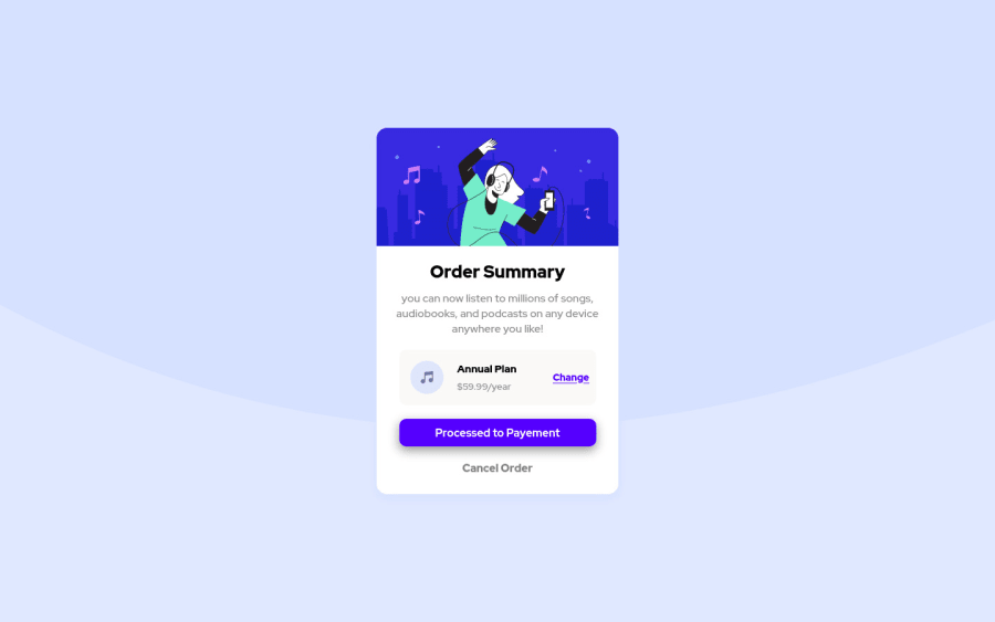
Design comparison
Solution retrospective
Your feedbacks are highly appreciated :)
Community feedback
- @Eric-FerolePosted almost 3 years ago
Great work. I would add, try to give meaningful name to your classes instead of partone, parttwo etc... And use semantic HTML element when possible <header> <footer> <main> etc. Here's a good article to start with.
Keep up !
Marked as helpful0@youzh00Posted almost 3 years ago@Eric-Ferole Hi Eric,Isincerely appreciate your positive feedback, thank you a lot.
0 - @darryncodesPosted almost 3 years ago
Hi Youssef,
Solid solution all round - nice one!
- i'd recommend updating your body styling
background-size: 100% auto;and removingbackground-position: 0 -280px;to closer match the design - you could clear your accessibility/html report if you added
alt-textto your images, swapped<div class="background">with<main class="background">and swapped yourh4with ah2. Semantic html is really important and headings shouldn't skip levels
Hope that helps!
Marked as helpful0@youzh00Posted almost 3 years ago@darryncodes Hello Darry, I appreciate the time you took to share your feedback, thanks for the help .
0 - i'd recommend updating your body styling
- @KajaiaPosted almost 3 years ago
Try to add hover effects for your button and links. And always try to add alt attributes for images. Anything else looks good.
1@youzh00Posted almost 3 years ago@Kajaia Hi lasha, i really appreciat your valuable feedbacks, thanks a lot .
1
Please log in to post a comment
Log in with GitHubJoin our Discord community
Join thousands of Frontend Mentor community members taking the challenges, sharing resources, helping each other, and chatting about all things front-end!
Join our Discord
