Design comparison
Solution retrospective
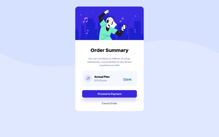
I was not sure how to position the word Change in the Anual plan box. I had to set position: relative and set coordinates :D ... does not feel right.
Also Iam not sure if i can set different background for mobile devices, since there is (images folder) another background image for mobile.
Any suggestion is welcome. Thank you.
Community feedback
- @Hanka8Posted over 2 years ago
Hi Maca, nice work!
here are some suggestions:
• you can use "min-height: 100vh" on body, so it takes 100% of the viewport, then apply "display: flex", "justify-content: center" and "align-items: center" to have your card centered nicely;
• if you want to center something horizontally, you can use "position: relative", "top: 50%", "transform: translateY(-50%) like this https://codepen.io/hanka-marukeviov-/pen/XWZJmoM
• you should add some "@media" and change the size of the card on mobile screen
Happy coding! ☺☺☺
Marked as helpful1
Please log in to post a comment
Log in with GitHubJoin our Discord community
Join thousands of Frontend Mentor community members taking the challenges, sharing resources, helping each other, and chatting about all things front-end!
Join our Discord
