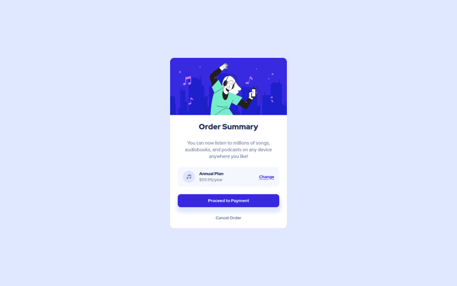
Design comparison
Solution retrospective
Hello community, my solution for this challenge.
Community feedback
- @GitHub-dev12345Posted almost 3 years ago
Used this code for background image : In body tag used this CSS property: body{ background : url("./images/uesd image path") no-repeat; background position: top center; background size: 100% 50%; ( this is your choice check the image performance, and the gave the size percentage on your choice); this code very helpful for your background image😉😎 keep it up; } this code helpful for you, plz click on the mark the helpful
Marked as helpful1 - @DarrickFauvelPosted almost 3 years ago
Hi Rony, nice job.
For your button, you might want to add
cursor: pointerto your style rule. https://developer.mozilla.org/en-US/docs/Web/CSS/cursorAlso, you may want to try adding
transition: .2s ease-in-outon your buttons. https://developer.mozilla.org/en-US/docs/Web/CSS/transitionHappy coding! 😊 :D
Marked as helpful1 - @ramonreyPosted almost 3 years ago
Good job, just add the background to your Body.
Marked as helpful0 - @GitHub-dev12345Posted almost 3 years ago
Hope this code helpful for you apply this code in your project 😊 results very impressive, then click on marked as helpful.
0 - @GitHub-dev12345Posted almost 3 years ago
used this CSS Property in your card to increase and decrease the size of card:
1.In Card design CSS Code Used this:
transform : scale(0.8); this property decrease the size of card. 😉
large size for increase the number of scale & small size for decrease the number of scale
0 - @NaveenGumastePosted almost 3 years ago
Hay ! Rony Good Job on challenge
-> Learn more on accessibility issues
If this comment helps you then pls mark it as helpful!
Have a good day and keep coding 👍!
0
Please log in to post a comment
Log in with GitHubJoin our Discord community
Join thousands of Frontend Mentor community members taking the challenges, sharing resources, helping each other, and chatting about all things front-end!
Join our Discord
