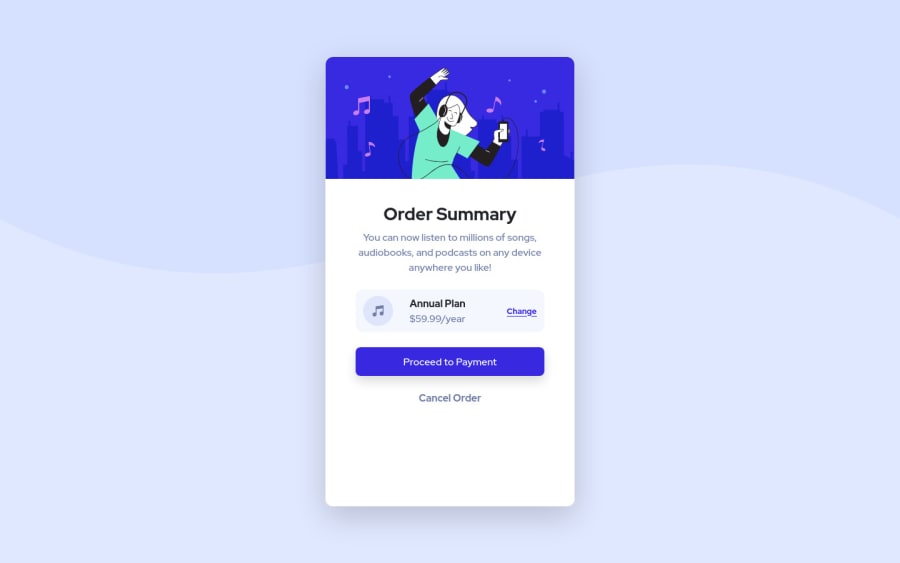
Design comparison
SolutionDesign
Solution retrospective
Suggestions & criticisms are highly appreciated 🌹
Community feedback
- @kens-visualsPosted about 3 years ago
Hey @JoyShaheb 👋🏻
I have some suggestions to help you fix the accessibility issues and some other things.
- In your markup,
<div class="card">...</div>should be<main class="card">...</main>and this will fix the accessibility issues. Just, don't forget to generate a new repot once you fix the issues. - I suggest removing
min-height: 80vh;from.card, that will make the card to look closer to the original design. - In general, avoid using
!importantbecause in a bigger project it can cause a lot of issues, especially when you work with a team. If everyone adds!importantyou'd have 10000 lines of CSS just overwriting each other. - For the hero image, instead of
alt="..."please come up with something descriptive, such asalt="a woman listening to music and joyfully dancing" - For the music icon, add
aria-hidden="true”, because it's for decoration. You can read more aboutaria-hiddenhere. - Also, I suggest adding
transition: all 0.2s;to the button and the links, this will make:hoversmoother.
I hope this was helpful 👨🏻💻 all in all, you did a great job, well done. Cheers 👾
Marked as helpful1@JoyShahebPosted about 3 years ago@kens-visuals Thank you for the suggestions Ken I really appreciate it, Keep up the good works 🌹
0@kens-visualsPosted about 3 years ago@JoyShaheb you're welcome and thank you too 😇 I'd really appreciate if you could mark the comment as helpful 🙃
Marked as helpful1 - In your markup,
Please log in to post a comment
Log in with GitHubJoin our Discord community
Join thousands of Frontend Mentor community members taking the challenges, sharing resources, helping each other, and chatting about all things front-end!
Join our Discord
