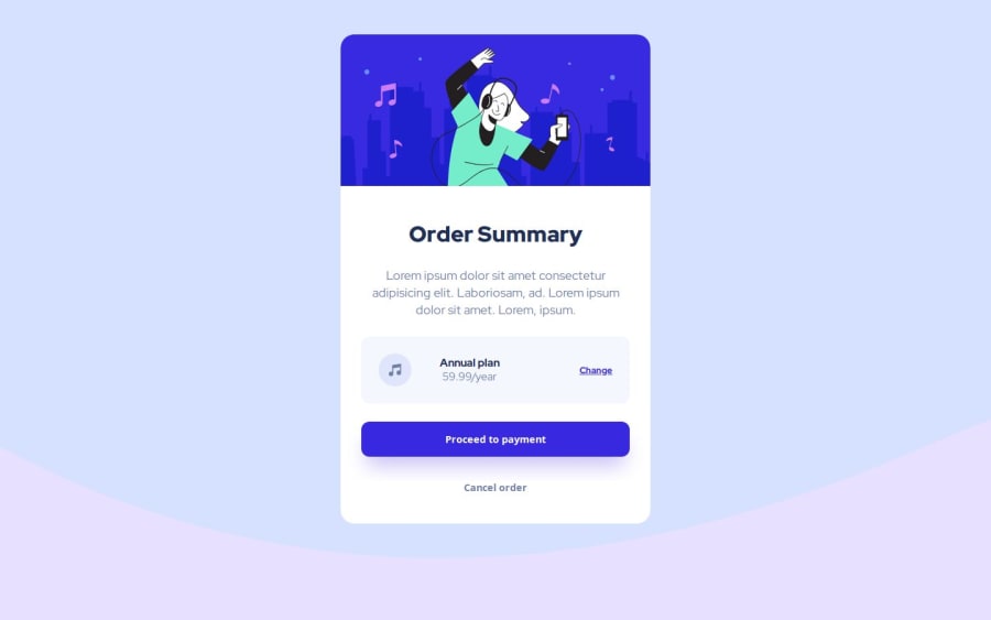
Design comparison
SolutionDesign
Solution retrospective
Explanation guidance wasn't very clear.
Community feedback
- @MaximilianoDanielGarciaPosted over 1 year ago
Hi @imonBlaze, good job!
Check this code to improve your background image and to center the card:
body {
    display: grid;
    place-items: center;
    min-height: 100vh;
    background-size: contain;
    background-color: hsl(225deg 100% 95%);
    background-position: center -25%;
}
The
background-size: contain;property resizes the background image to make sure the image is fully visible.After you apply these it will be look better.
0@imonBlazePosted over 1 year agoHey @MaximilianoDanielGarcia thank you so much I will try.
0
Please log in to post a comment
Log in with GitHubJoin our Discord community
Join thousands of Frontend Mentor community members taking the challenges, sharing resources, helping each other, and chatting about all things front-end!
Join our Discord
