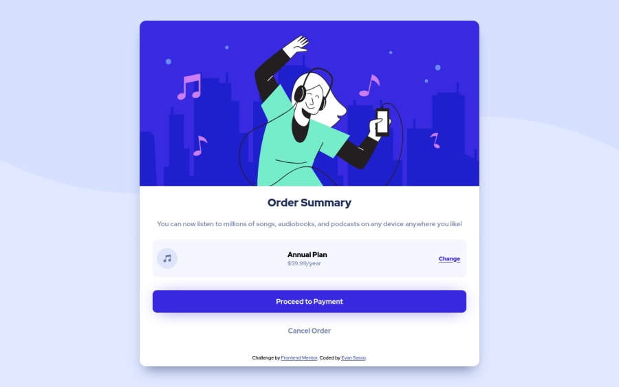
Design comparison
Solution retrospective
-
What is the best way to go about obtaining the height and width ratios that the design called for? I had trouble controlling the size of the pricing panel in the desktop view (i.e. larger than 375px), but wasn't getting anywhere. So the ratio was off when I finished building the original design in the mobile view.
-
Are there better units to use when building mobile first in order to retain the design when moving to larger views? Where maybe I wouldn't need to adjust everything single aspect of the panel, but just the height and width?
Community feedback
- @portalionPosted about 3 years ago
Best units for responsive design are either rem/em for fonts, paddings, margins and percents/vh/vw/vmin/vmax for width and height.
Marked as helpful0@esassoPosted about 3 years ago@portalion I appreciate you taking the time to review my work and reply to my questions. I'll be putting your suggestions into practice in my next challenge. Thank you again
0
Please log in to post a comment
Log in with GitHubJoin our Discord community
Join thousands of Frontend Mentor community members taking the challenges, sharing resources, helping each other, and chatting about all things front-end!
Join our Discord
