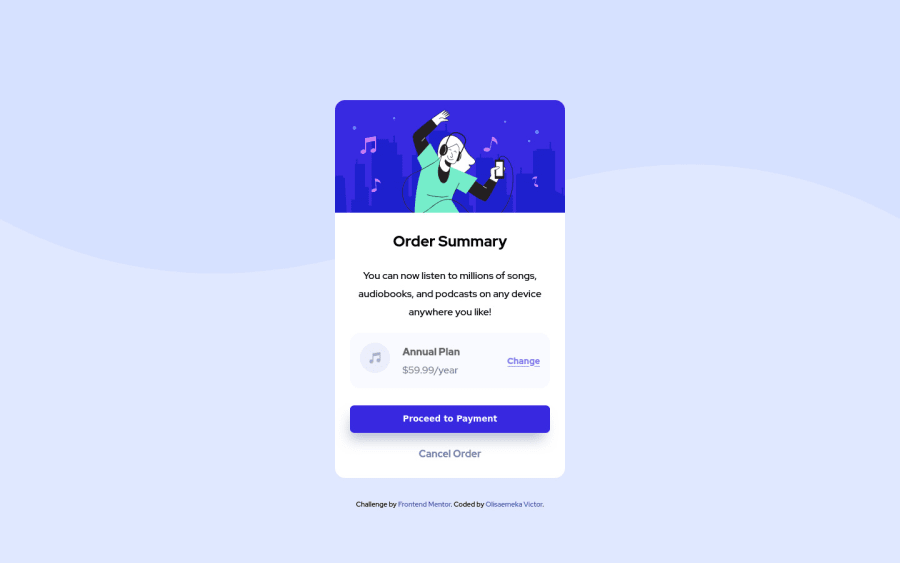
Design comparison
Solution retrospective
I would really appreciate and love if I can get some feedback from the community.
Community feedback
- @correlucasPosted over 2 years ago
👾Hello @olisa187, Congratulations on completing this challenge!
I like the work you’ve done here, your solution is almost complete. I’ve some suggestions for you to improve the code/design:
1.Replace the
<h2>containing the main title with<h1>note that this title is the main heading for this page and every page needs one h1 to show which is the most important heading. Use the sequence h1 h2 h3 h4 h5 to show the hierarchy of your titles in the level of importance, never jump a level.2.Fix the alignment. The best way make this alignment is by using
FLEXBOX. The first step, is to addmin-height: 100vhto make the body height size becomes 100% of the viewport height, this way you make sure the container will be aligned vertically since thebodywill display ever 100% of the screen height. After that add two flex properties to make the alignmentdisplay: flex/align-items: center;/justify-content: center;. If you're using the attribution you need to addflex-direction: columnto make the attribution stays under the QR Code component. See the code below:@media (min-width: 23.5em) body { min-height: 100vh; background-image: url(images/pattern-background-desktop.svg); background-repeat: no-repeat; display: flex; align-items: center; justify-content: center; flex-direction: column; }Remove the paddings:
@media (min-width: 23.5em)
main {
    /* padding-top: 10em; */
}
main {
    max-width: 90em;
    margin: 0 auto;
    /* padding: 4em 1em 2em 1em; */
}
✌️ I hope this helps you and happy coding!
Marked as helpful1 - @AdrianoEscarabotePosted over 2 years ago
Hi Olisaemeka, how are you?
I really liked the result of your project, but I have some tips that I think you will like:
1- Every pages needs a
<h1>to show which is the most important heading. So replace the<h2>with<h1>and follow the sequence h1-h5Prefer to use
removerpxto have your page working better across browsers and resizing the elements properlyThe rest is great!!
Hope it helps...👍
1 - @aarsh07Posted over 2 years ago
Your submission is almost perfect , i just want to suggest that you should move that card to the center of the body because it's not perfectly in middle for now so that is just not looking good, everything else is pretty well .
1
Please log in to post a comment
Log in with GitHubJoin our Discord community
Join thousands of Frontend Mentor community members taking the challenges, sharing resources, helping each other, and chatting about all things front-end!
Join our Discord
