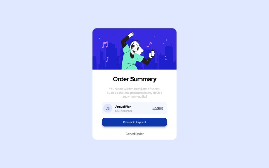
Design comparison
Solution retrospective
kindly everyone give your feedback , your feedback much helpful in my coding skills
Community feedback
- @yannmarcPosted over 1 year ago
Hi @karthikeyan13121999! Your solution looks good in my opinion.
Here are some modifications to make your code killers:
File System / Structure
- First and foremost, organize your files correctly. You should keep your project's assets in a public folder. It will be challenging for web crawlers to index your file system's content as it develops.
CSS
I like your CSS, but it could use a little more work.
-
Use CSS variables; they offer additional flexibility in terms of value and scoping accessibility. Therefore, use variables to make your CSS code **banger! **
:root { --variable-name: variable-value; -
DRY This approach to coding is crucial. Utilize the idea of utility classes to incorporate this into your CSS. To accomplish this, incorporate patterns into your design and create a ".utility-class" to hold them.
-
Using CSS Resets the browser's style and some HTML elements will make your life much more easier * -- Optional*
-
It's not advisable to do this
.box div{ padding: 8px;}because you can accidentally target create a layout where the above styling may apply, and may result in bugs. Rather use this: `.box .add-a-class-to-div {padding: 8px} -
For responsive design there's a pattern or approach called: mobile first so using
max-widthbut mobile first gives more flexibility.
Marked as helpful0@karthikeyan13121999Posted over 1 year ago@yannmarc thank you for your valuable advice sir.
0
Please log in to post a comment
Log in with GitHubJoin our Discord community
Join thousands of Frontend Mentor community members taking the challenges, sharing resources, helping each other, and chatting about all things front-end!
Join our Discord
