Design comparison
Solution retrospective
Please, I will need general and specific feedback. Thank you
Community feedback
- @AdrianoEscarabotePosted over 2 years ago
Hello everything is fine?
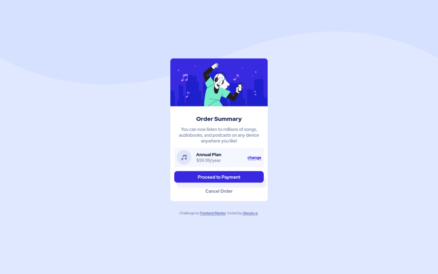
Congratulations on the challenge, you did a good job! I noticed that you didn't put the background that is in the example layout. If you had any problems or doubts during the process, I'll send you a simple and easy way to add:
body { background: url("../images/pattern-background-desktop.png") hsl(225deg, 100%, 94%) repeat-x; }Add this to your css, but make sure the image has the same name as this one.
The rest is really good! Hope it helps... 👍
1@okputu-ePosted over 2 years ago@AdrianoEscarabote I think my eyes where playing games on me. I thought I completely nailed the background color. However, thank you for this new simple solution. I will try it out and give you feedback.
1@okputu-ePosted over 2 years ago@AdrianoEscarabote for some reason your suggestion is not working for me.
1@AdrianoEscarabotePosted over 2 years ago@okputu-e just put
background-image: url(name of the image);and adjust it with this codebackground-size: 100% 50vmin;Hope it helps... 👍
0@okputu-ePosted over 2 years ago@AdrianoEscarabote Ok I will do so and get back to you
1
Please log in to post a comment
Log in with GitHubJoin our Discord community
Join thousands of Frontend Mentor community members taking the challenges, sharing resources, helping each other, and chatting about all things front-end!
Join our Discord
