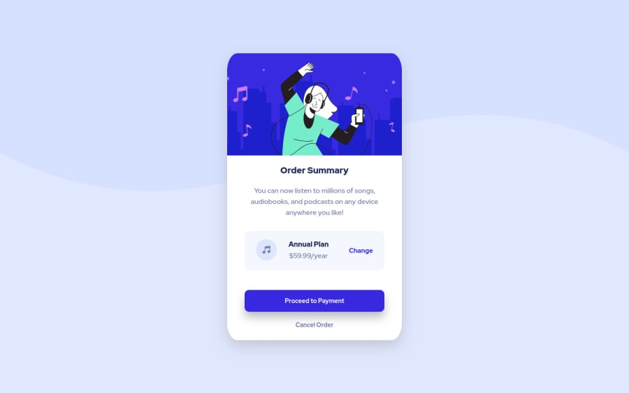
Design comparison
SolutionDesign
Solution retrospective
I would like any feedback if its possible good or bad. I'm good taking feedback to grow. I just wanted to learn and be better. Hope you like it. Please feedback!
Community feedback
- @alex-kim-devPosted over 3 years ago
Hi Daniel, good job on this challenge! I've been looking through it and here's what I want to mention:
- it's not necessary to wrap every image in a
<figure>element, it's required when you need to add a caption to it:
<figure> <img src="elephant.jpg" alt="Elephant at sunset"> <figcaption>An elephant at sunset</figcaption> </figure>- the
altattribute with description must be present on images, it helps screen reader users and displays on the screen if an image isn't loaded - the margins of body and main elements collapsing, resulting in weird body positioning (with an offset on the top). There's a great post on the topic
- the
<main>element already has semantics,role="main"is not necessary - use either
<a>or<button>, but don't mix both like<a role="button">
Good luck!
Marked as helpful1@dannzdevPosted over 3 years ago@Alex-K1m thanks a lot i know these feedbacks will help me improve. I made corrections, if you want to check it again it would be nice. I tried to make it less weird xD
1@alex-kim-devPosted over 3 years ago@dannzdev Looks good, have fun with the next challenge!
0 - it's not necessary to wrap every image in a
Please log in to post a comment
Log in with GitHubJoin our Discord community
Join thousands of Frontend Mentor community members taking the challenges, sharing resources, helping each other, and chatting about all things front-end!
Join our Discord
