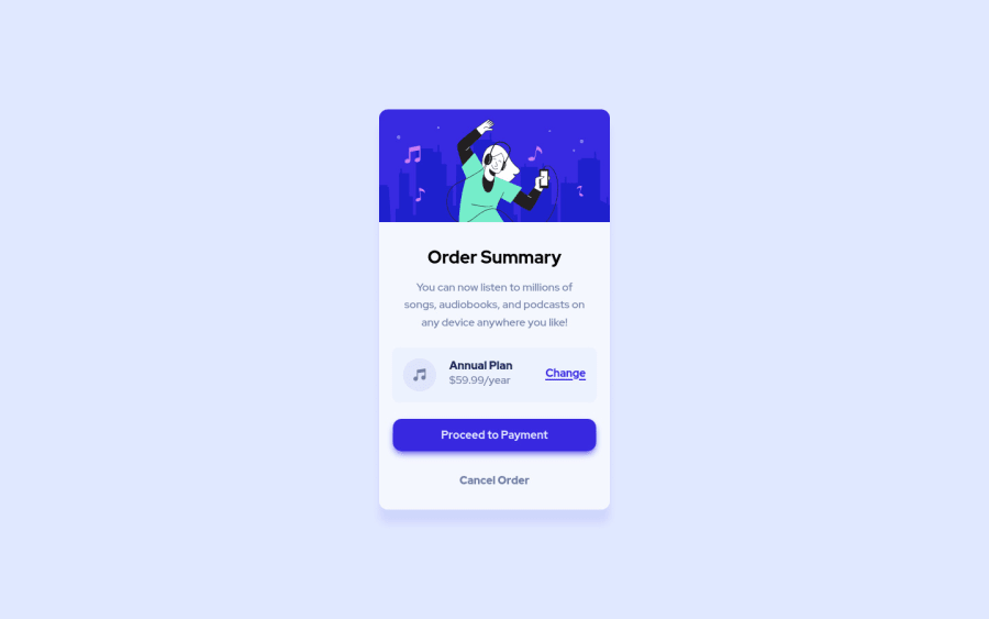
Design comparison
SolutionDesign
Solution retrospective
I think I did pretty well on this one, but if there's anything that can be changed, feedback is always welcome.
Community feedback
- @MehrshadHeisenberg3Posted over 1 year ago
Great job your design looks just as the original but there is a slight difference.
If you look at the original one, you can see that there are two waves in the background and not just a simple background color.
By adding this piece of code in your css you can make that happen!
  body {
    background: url(images/pattern-background-desktop.svg), #e1e9ff;
    background-repeat: no-repeat, no-repeat;
  }
You're actually saying that you want to use the svg for the background.
Great job again and I hope that you find this comment helpful!
0
Please log in to post a comment
Log in with GitHubJoin our Discord community
Join thousands of Frontend Mentor community members taking the challenges, sharing resources, helping each other, and chatting about all things front-end!
Join our Discord
