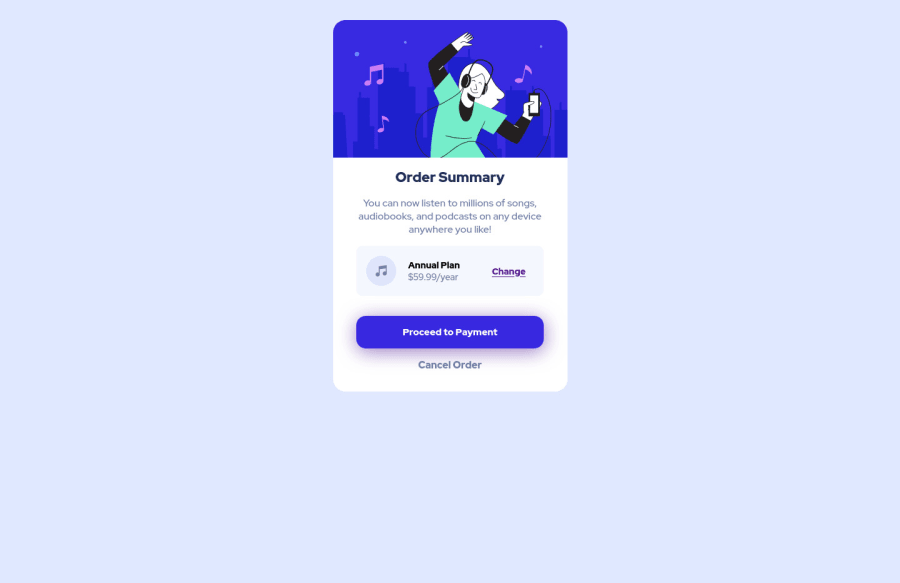
Design comparison
SolutionDesign
Solution retrospective
This is my solution to this challenge. Feel free to comment with your thoughts and suggestions so that I can improve my skills. Thank you!
Community feedback
- @AdrianoEscarabotePosted about 2 years ago
Hi Ibrahim Tangco, how are you? I really liked the result of your project, but I have some tips that I think you will enjoy:
To effectively center your component across all resolutions, prefer to do this:
body {
    display: flex;
    align-items: center;
    justify-content: center;
    min height: 100vh;
}
apparently you forgot the background image of the body, to put it add this to the body:
body {
    background-image: url(./images/pattern-background-desktop.svg);
    background-repeat: no-repeat;
    background-size: 100% 50vmin;
}
The rest is great!
I hope it helps... 👍
Marked as helpful0
Please log in to post a comment
Log in with GitHubJoin our Discord community
Join thousands of Frontend Mentor community members taking the challenges, sharing resources, helping each other, and chatting about all things front-end!
Join our Discord
