Not Found
Not Found
Not Found
Not Found
Not Found
Not Found
Not Found
Not Found
Not Found
Not Found
Not Found
Not Found
Not Found
Not Found
Not Found
Not Found
Not Found
Not Found
Not Found
Not Found

Submitted

Order-summary using flex box

Hannah Oā€¢ 60

@hannahro15

Desktop design screenshot for the Order summary component coding challenge

This is a solution for...

  • HTML
  • CSS
1newbie
View challenge

Design comparison


SolutionDesign

Solution retrospective


Hello, I don't think this is too bad as an attempt. I am pretty close I think. Any feedback would be appreciated. I had a few problems with the middle part of the flex-container lining up where it said 'Annual Plan' and the price. I was also confused how to get the box-shadow on the bottom/bottom-right of the button where it said 'Proceed to payment'. I am not quite sure if all my fonts, colours and sizes are correct though for all the elements. Thanks.

Community feedback

Shashree Samuelā€¢ 9,260

@shashreesamuel

Posted

Hey good job completing this challenge.

Keep up the good work

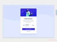
Your solution looks great however I think that your card needs to be centered in the middle of the screen. Try adding margin: 0 auto Secondly the annual plan part of the card needs some margin on the bottom using margin-bottom. Lastly the text in the button needs a bit of padding.

I hope this helps

Cheers Happy coding šŸ‘

Marked as helpful

0

Please log in to post a comment

Log in with GitHub
Discord logo

Join our Discord community

Join thousands of Frontend Mentor community members taking the challenges, sharing resources, helping each other, and chatting about all things front-end!

Join our Discord