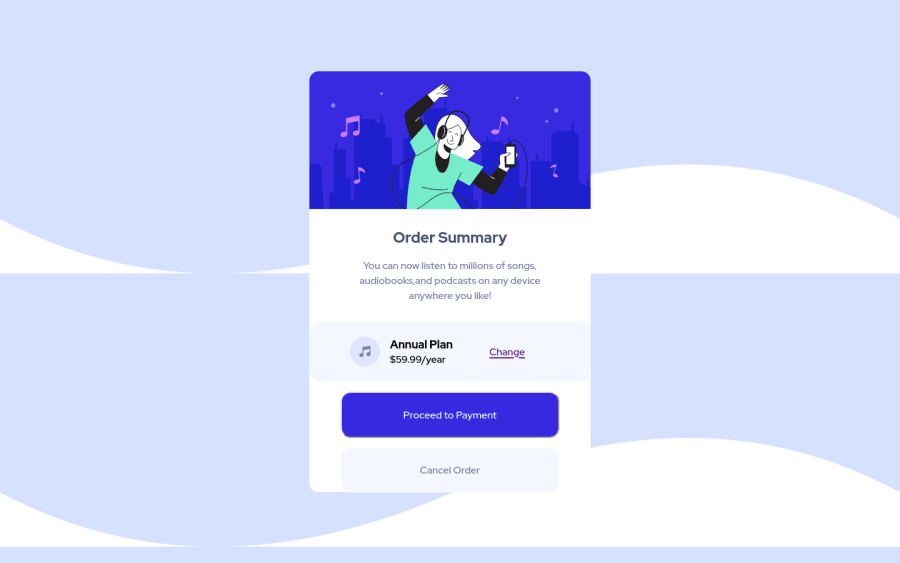
Design comparison
Solution retrospective
Completed this. Any feedback would be nice
Community feedback
- Account deleted
Hello there! 👋
Congratulations on finishing your challenge! 🎉
I have some feedback on this solution:
-
Always Use Semantic HTML instead of
divlike<main><header>, etc for more info. -
Add to the body
background-repeat:no-repeatto stop the repeating process, also add abackground-color:#e0e8ffto make it look exactly like the design.
if my solution has helped you do not forget to mark this as helpful!
Marked as helpful0 -
- @leoimeworePosted almost 3 years ago
Thanks for the background info.
I always get confused on to use the Semantic elements. I will be more conscious about them moving forward.
Thanks for the feedback
0
Please log in to post a comment
Log in with GitHubJoin our Discord community
Join thousands of Frontend Mentor community members taking the challenges, sharing resources, helping each other, and chatting about all things front-end!
Join our Discord
