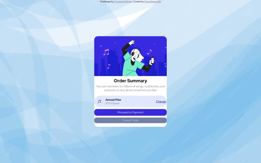
Design comparison
Solution retrospective
I feel satisfied to be able to carry out the activity without any inconvenience. Next time, keep in mind more about the widths and lengths and have more pixels assigned for the activity.
What challenges did you encounter, and how did you overcome them?The challenge was to organize the length and width, I overcame them by organizing the pixels for desktop and mobile, putting more detail into the edges and radius.
What specific areas of your project would you like help with?I would like to receive guidance on pading, display.
Community feedback
- @kodan96Posted 7 months ago
hi there! 👋👋
Instead of setting
max-widthonmainjust wrap your content inside a div (like you did with the hero section):<main> <div class="container"> <!-----All your content goes here----> </div> </main>and give that div (in this case the
containerdiv)a max-widthyour
<a>elements are taking up all the horizontal space, because you applieddisplay: block;on them. Modify it todisplay: inline-blockand you will be able to set margins to them, but they will still take up only the space they need, respecting the padding.Hope this was helpful 🙏
Good luck and happy coding! 💪
1@ElianaRestrepo99Posted 7 months ago@kodan96 Greetings, thank you very much for your advice to improve my code, they are very useful for my learning.
1
Please log in to post a comment
Log in with GitHubJoin our Discord community
Join thousands of Frontend Mentor community members taking the challenges, sharing resources, helping each other, and chatting about all things front-end!
Join our Discord
