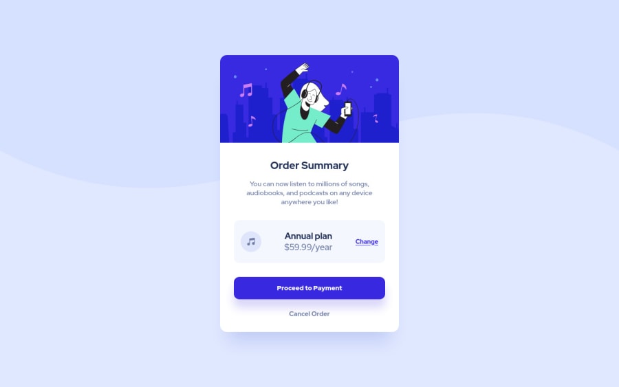
Design comparison
Solution retrospective
If someone has any tips or advice for me, I accept.
Community feedback
- @sandro21-glitchPosted almost 2 years ago
Hi Dev_Ruan_Alexandre.S
Here are some suggestions for your code
Use semantic HTML elements: You can improve the accessibility of your code by using semantic HTML elements (e.g. header, article, nav, etc.). In this case, you could wrap the heading and description in a header element and the "Order Summary" section in an article element.
Consider using CSS classes with descriptive names: This can make your styles more readable and maintainable. For example, you could use class names like "hero-img" instead of "img".
To make your code more scalable and to reduce the chance of conflicts, consider using CSS class names that are specific to the component and avoid using tag selectors.
Happy Coding
Marked as helpful0@ruanalexandreSPosted almost 2 years ago@sandro21-glitch Thank you for the tip, I hadn't thought of it that way yet. I will improve my codes!
0 - @adonmez04Posted almost 2 years ago
Hi, @ruanalexandreS. I checked your solution. It's a good one. Keep coding... I have a suggestion for you.
The flexbox has 1-direction flow, so we can use
paddingandmarginvalues in flexbox to align anyflex-items. In your case, you can use this code to move your flex-item:.price { /* text-align: center; */ font-size: 20px; padding-left: 20px; /* This property and value can be changed to your alignment.*/ }And you can use these properties with other flex-items to move them in your flex container. However, this feature only works in flexbox. We can't use it like this in CSS Grid.
Check some good solutions and implement to your code. I hope this will help you to improve your perspective. Keep coding. All the best.
0
Please log in to post a comment
Log in with GitHubJoin our Discord community
Join thousands of Frontend Mentor community members taking the challenges, sharing resources, helping each other, and chatting about all things front-end!
Join our Discord
