Design comparison
Community feedback
- @correlucasPosted over 2 years ago
Hello AKSHAR, congratulations for your challenge solution!
I'm with your solution open and I've some tips for you:
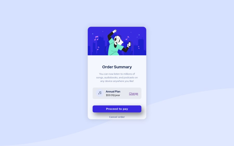
1.Background: you've add the background-image inside the container, this will cause some issues due the fact the background-image will be related to the container. You can fix this adding the
background-colorandbackground-imageto the bodybody { background-color: hsl(225, 100%, 94%); background-image: url(./images/pattern-background-desktop.svg); }2.You've add the property
height: 100vh;to the .container this property goes on the body, consider doing this change to make this changes to the body not the container.3.Align the card using flexbox, first add flex to the body
body { display: flex; align-items: center;align-content: center; height: 100vh}and then to the containerdisplay: flex;andflex-direction: column.See if this changes fix those issues! I hope it helps you.
Marked as helpful0
Please log in to post a comment
Log in with GitHubJoin our Discord community
Join thousands of Frontend Mentor community members taking the challenges, sharing resources, helping each other, and chatting about all things front-end!
Join our Discord
