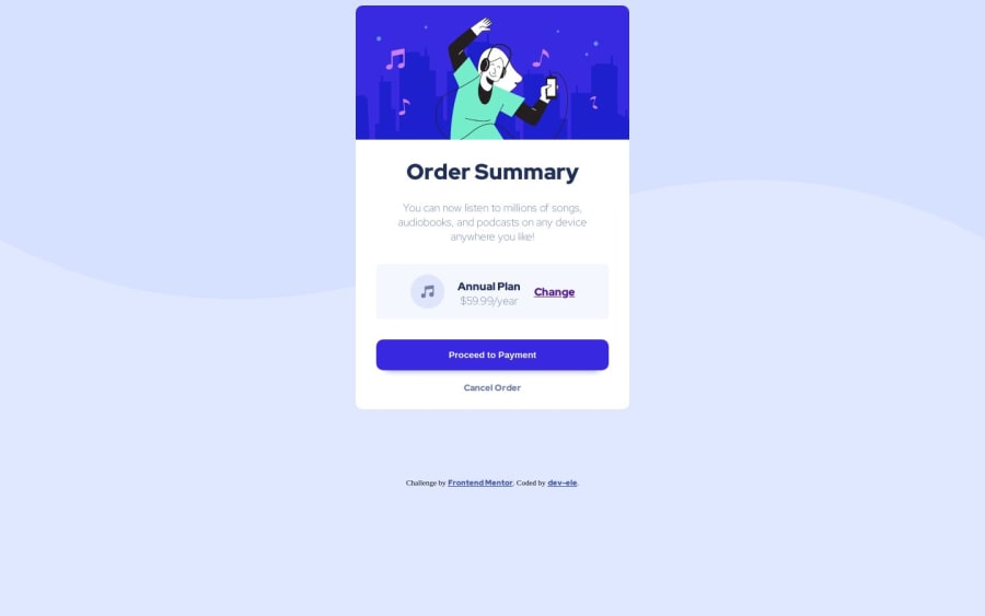
Design comparison
SolutionDesign
Solution retrospective
I found it difficult to get all the colors right. I think My code is decent but can always be improved.
Community feedback
- @Abdelrahman0KhaledPosted over 1 year ago
Congratulations on completing this challenge bro❤️ , but i see you have litle problem with centering the card , you can fix it by adding to body this
    margin: 0;
   padding : 0;
    min-height: 100vh;
    display: flex;
    align-items: center;
    justify-content: center;
and
flex-direction: column;to have div of in the "attribution" under div of "card"
0
Please log in to post a comment
Log in with GitHubJoin our Discord community
Join thousands of Frontend Mentor community members taking the challenges, sharing resources, helping each other, and chatting about all things front-end!
Join our Discord
