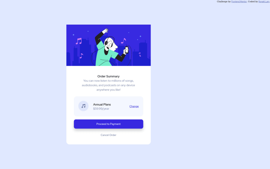
Design comparison
SolutionDesign
Solution retrospective
Give me feedback on how I can improve my coding skills. This was my first website to create and it took me forever to get this done, but I finally did it.
Community feedback
Please log in to post a comment
Log in with GitHubJoin our Discord community
Join thousands of Frontend Mentor community members taking the challenges, sharing resources, helping each other, and chatting about all things front-end!
Join our Discord
