


@FluffyKas
Posted
Hiya,
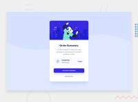
You solution perhaps looks a bit funny below 400px but on screens larger than this it's great. I looked through your code and try to provide some useful feedback:
-
This is only a component from a bigger website so having your image wrapped in a
headerisn't the best probably. I'd just wrap everything inmain. Not a big issue though, if you'd like to treat this card as a standalone thing, then usingheaderis just fine. But in this case, wrapping your image in an extradivwon't be necessary. -
You don't need to wrap your title in a
div, it's completely unnecessary again. -
Your summary description should be a
p.divisn't semantic at all, use it only for grouping elements for styling. -
Music icon alt text: Remove the alt text altogether, this image is decorative only. Add an
aria-hidden=true, as well. I leave this article here about alt texts, this is probably all you ever need to know to write good ones. -
"plan__description"
span: this is a good use case for adiv. As I mentioned above, for grouping elements together for styling! Even thoughspananddivare both meaningless elements semantically speaking, they aren't interchangeable.spanis for styling text inline (if you'd like to make part of a paragraph bolder, for example). -
Your buttons should be inside
main. They're still part of the main content. -
Don't ever use a
divfor buttons. There's a perfectly semantic element for this. It's calledbutton. They might be trickier to style (actually not, you just need to get rid of/override some default styles), but still, that's not a good reason to replace something so important with a semantically meaningless div.
Now for the CSS:
There's a logical flaw in your solution perhaps that why it isn't working the way you wanted. You either put a max-width on your card AND use min-width in media query or the other way around. Generally, it's the best to start styling from mobile view and then make adjustments as the screen size grows if necessary (in this case, your media queries will use always min-width). I'd try keeping this in mind and swapping media queries to min width. You're already using a max-width on your card so your solution should be perfectly responsive. The only thing that might actually require a media query is the background image ^^
Media queries can be confusing at first but just try to keep a mobile view first approach in mind and they'll get easier ^^
Now to answer the questions:
-
There's so many, it's hard to make a list here. Under this video you can sign up for a html tag cheat sheet. I haven't seen it, but I trust Kevin Powell so I'd recommend checking it out. The video itself is also super useful if you're new to semantic html.
-
I don't think there are common breakpoints. As I said before, start from mobile view and then make a guess for a min-width breakpoint. I usually start with doing
min-width: 65remand then modify it if needed. It really depends on the design. When there are multiple sections in a website, I sometimes even use different breakpoints for them. -
For the bg image I used
background-size: containand I think it worked ok.
Sorry for the wall of text under such a tiny component, I hope at least it will be useful for you in the future. Good luck! :)
Marked as helpful
@humbruno
Posted
@FluffyKas Thank you for taking the time to read through my solution and share your feedback! It's extremely helpful and I'll make sure to keep these in mind for the next challenge :)
