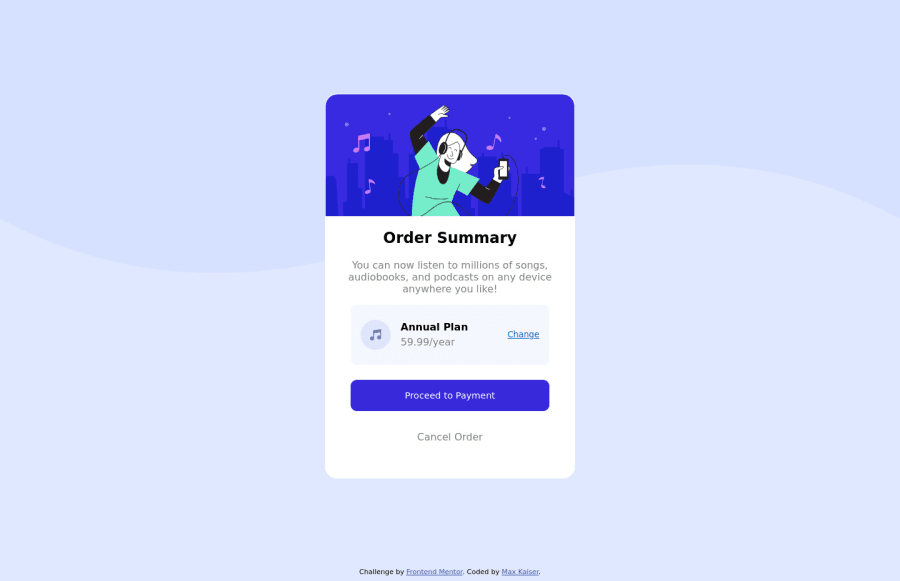
Design comparison
Solution retrospective
Hi all! Thanks for reviewing.
The only thing I couldn't figure out was how to make the background not stretch way down the way it does. It doesn't match the design preview.
Community feedback
- @NaveenGumastePosted almost 3 years ago
Hello Max Kaiser ! Congo 👏 on completing this challenge
Let's look at some of your issues, shall we:
-
You have to use
<html lang="en">. -
Add Main tag after body
<main class="container"></main>
happy Coding😀
Marked as helpful0 -
- @denieldenPosted almost 3 years ago
Hi Max, I took some time to look at your solution and you did a great job!
Also to make it look as close to the design as possible set
background-size: contain; and background-position: top centertobodyclass and usebuttontag for improve AccessibilityOverall you did well :)
Hope this help and happy coding!
Marked as helpful0
Please log in to post a comment
Log in with GitHubJoin our Discord community
Join thousands of Frontend Mentor community members taking the challenges, sharing resources, helping each other, and chatting about all things front-end!
Join our Discord
