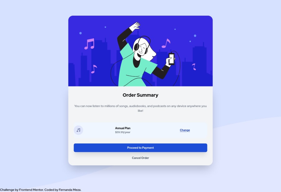
Design comparison
Solution retrospective
I would like some tips on how to keep the design looking proportional when doing larger resolutions, as anything above w1440 looks too spread out and i'm not sure if that's the best solution. Any comments or things i can change or make better would be greatly appreciated!
Community feedback
- @leonardomeza87Posted over 3 years ago
Try using max-width in pixels instead of percentage when you are no longer in mobile resolution
Btw it's funny that we have the same last name xD
1 - @fvaldes0109Posted over 3 years ago
Try readjusting the "music icon / anual plan / change" part. Something like set its container centered and with a smaller fixed width. Also try to
float: leftthe icon and the text, andfloat: rightthe 'change'. Hope it helps0
Please log in to post a comment
Log in with GitHubJoin our Discord community
Join thousands of Frontend Mentor community members taking the challenges, sharing resources, helping each other, and chatting about all things front-end!
Join our Discord
